Showing posts with label Matt Hollingsworth. Show all posts

Thursday, March 8, 2018

Batman: White Knight #6 - A Review

Commissioner Gordon is finally ready to turn on The Batman, but the prospect of bringing him in is easier said than done even with Nightwing's help. Councilman Jack Napier has a plan, but can even he stop his old enemy? And what will he do when The Neo Joker strikes  at an unprotected Gotham City?


I fear I'm growing repetitive with my praise for this series. There's nowhere to go once you've already declared it the best, most original thing done with Batman in the last decade.  The artwork is finely detailed without being over-cluttered and the colors are all perfectly chosen. If you haven't been reading this series, grab the reprints of the early issues or the earlier issues off of ComiXology. And if you have been reading this series, know that this issue is as fine as what has come before. Also, good for you!

 The Final Analysis: 10 out of 10.

Sunday, January 7, 2018

Batman: White Knight #4 - A Review

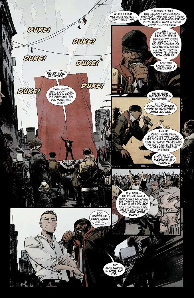
Working with firebrand community organizer Duke Thomas, Jack Napier has launched his next attack on the corrupt administration supporting The Batman. First, by running for City Council in the racially repressed Backport district then by offering the GCPD a plan that would buy their SWAT team better toys than Batman's using existing funds. Unfortunately, as Jack and Harleen enjoy their new life together, the other Harley Quinn, Marian Drews, plots to get her Puddin' back.


Though lacking in the surprising revelations and action of earlier issues, Batman: White Knight #4 continues the trend of every issue of this series outdoing the previous one. Sean Murphy continues to impress with this spirited tale of a Gotham City where The Joker proves to be an even greater threat to The Batman as a civic-minded citizen than an anarchistic madman. And let's not forget Matt Hollingsworth on the color art and Todd Klein's lettering!

The Final Analysis: 10 out of 10.

Thursday, December 7, 2017

Batman: White Knight #3 - A Review

An organized attack by all of Batman's Rogues Gallery of enemies taxes Batman, his allies and The GCPD to the breaking point. Yet this is only the opening salvo of Jack Napier and Harleen Quinzel's plan to bring down The Bat and the rich elites and corrupt government that back him. Yet even as they plot and plan, so too dos Marian Drews - the second Harley Quinn, who wants her Joker back!


There is a theory among film fans that the ultimate goal of The Joker in The Dark Knight was the destruction of the corruption that ran Gotham City. On the surface, this seems crazy, but consider the outcome of The Joker's actions. By the end of the movie, the police department is under the control of the most honest cop in town, Jim Gordon, most of the gangsters who ran the city are dead or defunded and a dangerous vigilante who inspired numerous incompetent copycats is forced to retire.

This theory came to mind while I was considering the action of Batman: White Knight #3 and the irony that an orderly-minded, civilly-active Joker is a far greater threat to the machine that runs Gotham City that the chaotic Clown Prince of Crime ever was. He's also far better at pushing Batman over the edge and encouraging people to question authority.

What Sean Murphy is doing with this series is a miracle on every level. It is simultaneously a tribute to everything we love about Batman and yet nothing like anything we've seen before done with the character. If you aren't already reading it, you should be.

The Final Analysis: 10 out of 10. Great story. Great art. A modern masterpiece! 

Monday, October 21, 2013

Hawkeye #13 - A Review

Hawkeye #13 brings decompressed storytelling to a new low.  Remember everything we saw over the last few issues that only related to Clint Barton in the most indirect ways possible, including a story told from the perspective of his dog, Lucky?  Now, after four issues and six months, we finally get to see the events of those issues from our main character's point of view. 


Thankfully, there's enough new material to make the repetitiveness tolerable.  Still, it is frustrating to see a writer of Matt Fraction's talent resorting to art for art's sake in order to pad out a storyline.  This series does not need such trickery.  It needs more straight-forward action and humor. 


At least David Aja and Matt Hollingsworth are back doing that voodoo that they do so well.  Aja's distinctive artwork gives this book an aesthetic all its' own.  Hollingsworth's palette completes the amazing effect.  Every page of this book is Eisner worthy. 

Monday, July 29, 2013

Hawkeye - Annual #1 - A Review

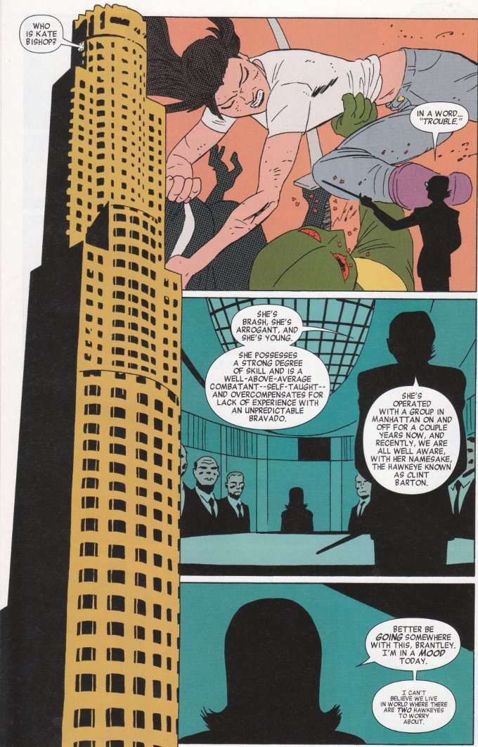
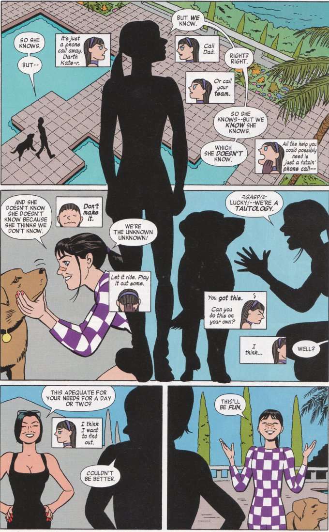
Sorry, Clint Barton fans! Once again your regularly scheduled comic book has been subverted!  For Hawkeye Annual #1 focuses upon Clint's sidekick/partner/something, Kate Bishop!

This issue is all about Kate striking out on her own in Los Angeles.  Without her mentor.  Without her team.  Without her rich dad.  Sadly, Kate is about to discover how difficult things can be when you're all alone and - suddenly - without resources.  For Madame Masque - whom Kate was not exactly gentle to in Hawkeye #4 & Hawkeye #5 - is out for revenge and has ample power to make Kate's life difficult.    


It's redundant for me to speak of Matt Fraction's writing on this series at this point.  Either you hate his knowingly smart subversion of the classic action movie cliches or you love them.  I love them.  I love how Kate isn't fooled for a moment by Madame Masque's attempts to win her confidence in disguise and is portrayed as being smart and competent enough to cope with a revenge-minded villain far more easily than she is sudden destitution and joblessness. 


I likened Javier Pulido's previous Hawkeye work to the second coming of Jack Kirby.  Seven months later, I stand by that statement, though this issue has little of the dynamic action that usually defines the term Kirbyesque.  Yet there is a smooth simplicity of function to Pulido's artwork that is reminiscent of The King and the book maintains a classic Marvel feel throughout. 

Sunday, June 30, 2013

Hawkeye #11 - A Review

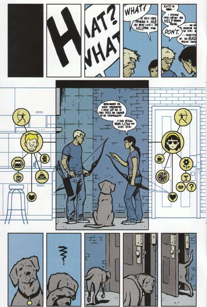
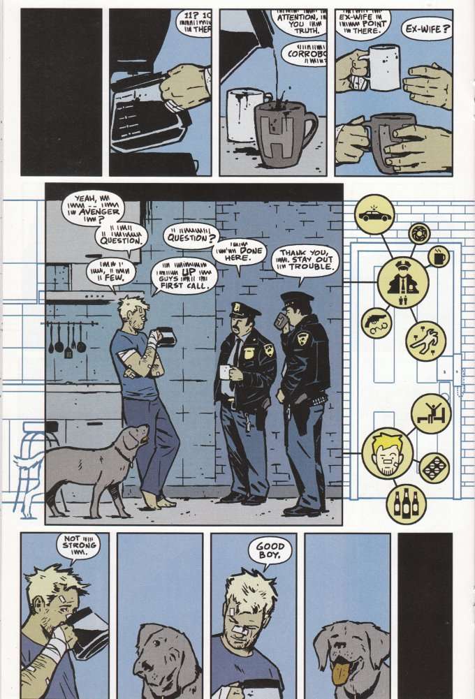
This month's issue of Hawkeye, like last month's issue, sees Matt Fraction and David Aja playing with the idea of how graphic fiction works.  However, this issue is very different from Hawkeye #10, which played with stories being told through multiple viewpoints, with ideas being introduced out of sequence.  This month's issue, by contrast, is told entirely from the perspective of Lucky a.k.a. Pizza Dog a.k.a. Arrow a.k.a. Hawkeye's Dog.


The only story I can think of that has attempted to tell this kind of story in quite the same way is the episode of The Simpsons where Bart took his dog to obedience school and we were treated to a dog's eye view of the world, with everything rendered in black and white and all human language depicted as a series of drones except for certain key words. The language is treated in a similar fashion here but Lucky's perspective is further augmented by pictograms depicting what Lucky smells and hears that the humans around him miss.  It turns out they miss a lot and Lucky has a run-in with his former owners in the Pottsylvanian Mafia trying to investigate a murder that occurred right under Clint Barton's nose.  


This is, to put it simply, a brilliant idea and it is very well-executed graphically and textually.  I imagine dog lovers - even those who aren't usually comic readers - might get a kick out of this story, just for the novelty value.  The one flaw?  The final scene, which would really have benefited from having the full dialogue that Matt Fraction writes so well.  What happens is clear but I really want to know the exact words that are said!

Saturday, April 20, 2013

Hawkeye #9 - A Review

There is no small irony that Hawkeye #9 should leave me unsatisfied on the same week that the series was nominated for multiple Eisner Awards.  The sad fact is that this issue has little of the humor or action that made the previous issues so enjoyable.  Dead.  That's the only word I can use to describe it.  This book is dead.

Generally, I hold a preference for DC Comics heroes over Marvel Comics's simply because I find so many of the Marvel heroes - particularly those among The Avengers - disagreeable as characters.  I accept that heroic characters need not always be likeable nor do they always need to act in admirable ways but I read superhero books to be inspired and to get away from unreasonable personalities.  This is not to say that this issue is badly written.  Far from it.  It's just a matter of what I enjoy reading and this issue... well, this issue wasn't enjoyable.  There's none of the fun that previous Hawkeye issues held.


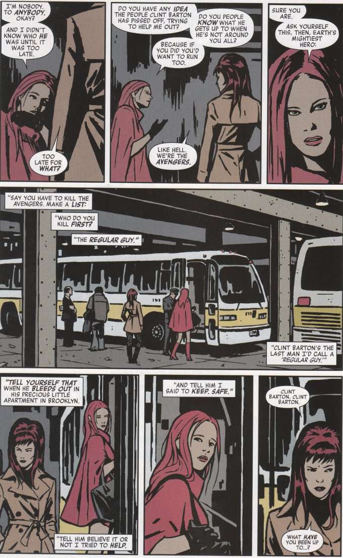
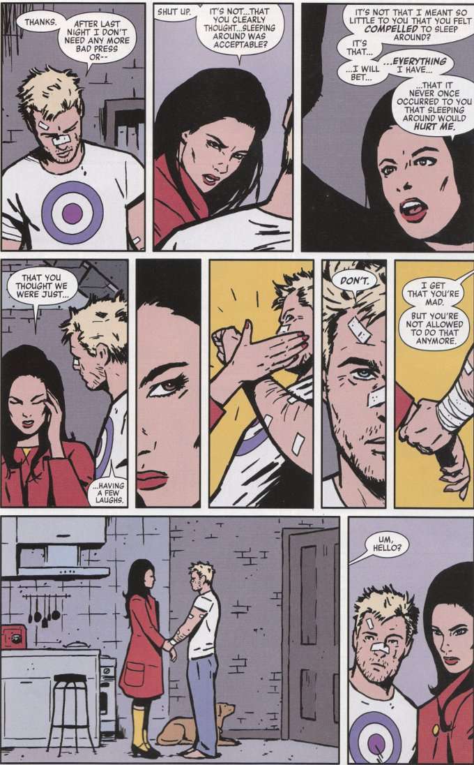
With two exceptions - Black Widow and Kate Bishop, I found every character in this issue to be wholly unsympathetic.  Clint Barton spends the entire issue moping around his apartment while the women in his life are investigating - and cleaning up - the latest mess in his life.  Mockingbird shows up to finalize their divorce paperwork on Valentine's Day and adds insult to injury by calling attention to that fact.  And Jessica "Spider Woman" Drew is revealed to be a physically abusive girlfriend.  Thankfully, Clint refuses to tolerate this (and a good thing too considering she has super strength), so kudos to Matt Fraction for refusing to play this scene for laughs.  Regardless, this issue is low on action and high on unpleasant people being rude to one another.  If I wanted to read that, I could go read the comments on any Yahoo News article. 


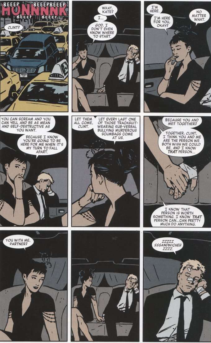
At least the artwork by David Aja and Matt Hollingsworth is as fine as ever.  I struggle to find words to describe Aja's distinctive style, which is unlike any artist I can think of.  Hollingsworth's coloring, as always, adds another unique level to the issue's proceedings.  While the story left me flat this month, I have no complaints about the artwork.

Can I recommend this series?  Yes.  Would I recommend this issue?  No.  In terms of story, nothing of note happens until the last page and in terms of character nothing happens apart from it being made clear that Clint Barton is once again single in no uncertain terms.  Go pick up the TPB collection of the early issues if you want to see what all the excitement is about.  There's no excitement to be found in this issue.   

Wednesday, March 6, 2013

Hawkeye #8 - A Review

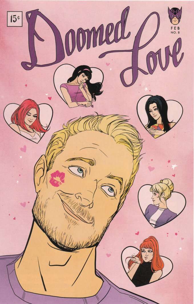
Hawkeye #8 came out a few weeks too late for Valentines' Day but romance is very much at the center of this issue.  The action is broken up by a number of splash pages with art by Annie Wu, which resemble the romance comics of yesteryear.  All of these mock-up covers are excellent but my favorite is probably the one pictured below - partly because of the style and partly because it supports my theory that Hawkeye is slowly turning into Oliver Queen.


Behold... the beginnings of The Beard!

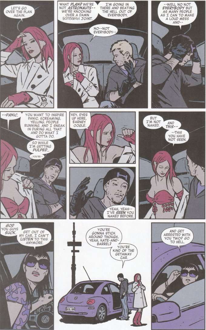
The plot centers around the return of the mysterious redhead who sold Clint a car before having a quick fling back in the hilarious Issue #3.  She's in trouble again and is ready to drag a not-totally-unwilling Hawkeye along with her.  Naturally complications abound and hilarity ensues as they only can when Matt Fraction is at the storyteller's wheel. 


David Aja's artwork is as welcome as ever.  All of the artists on this book have been good ones, but Aja's subdued style has quickly become the definitive look of Hawkeye.  The color-scheme utilized by Matt Hollingsworth also adds to the overall excellent effect that makes this one of the most distinctive and unique-looking comics in existence.

If you aren't reading Hawkeye by now, I don't know what else I can say to get you to start.  Great writing.  Amazing artwork.  What more could you ask for? 

Monday, December 24, 2012

Hawkeye #6 - A Review

Hawkeye #6 is not just a holiday special.  It is the culmination of the last five issues of barely-contained brilliant insanity.  Titled Six Days In The Life of Hawkeye (or Six Nights In the Life of Hawkeye if you go by the cover instead of the title page) , this issue covers exactly that.  We focus on Clint Barton's actions across the better part of a week, all out of order, as he attempts to take a vacation, finish moving into his new apartment and catch up on some TV.


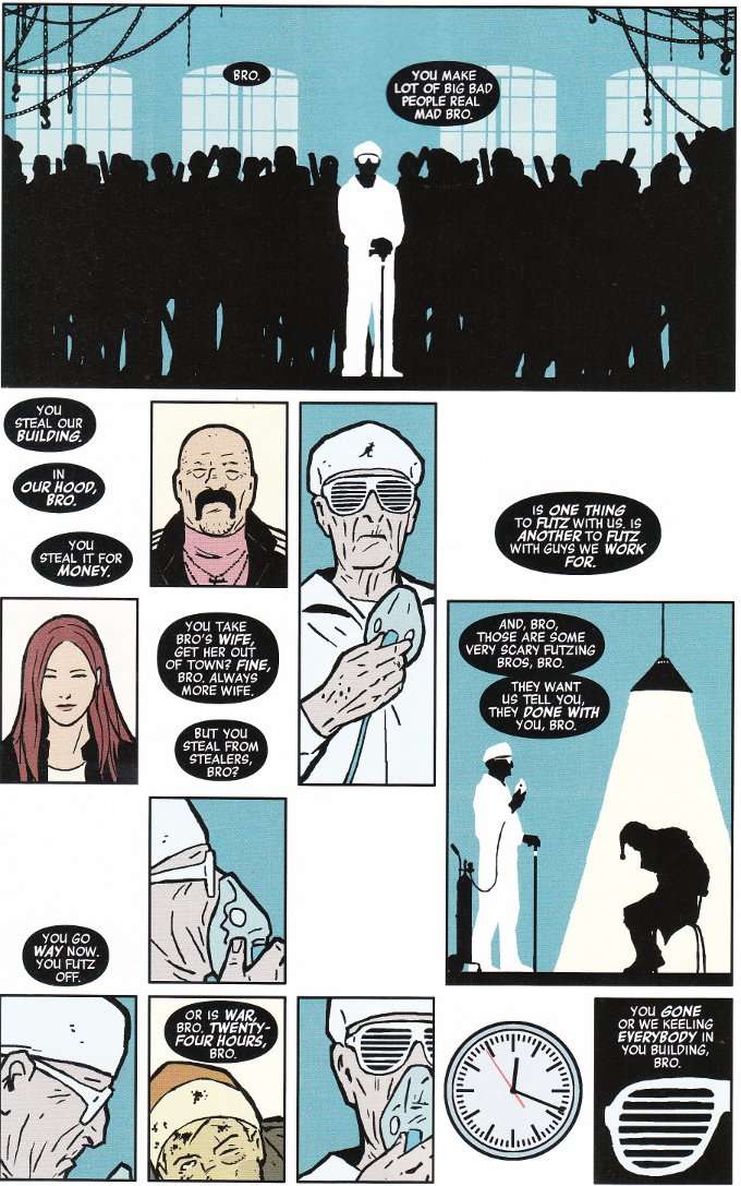
Naturally things aren't that simple and Clint once again runs afoul of the Russian mobsters who have been a pain in his butt since the first issue.  Matt Fraction depicts all this with the trademark humor we've come to expect from this book.  Amazingly, despite this issue being rather continuity-heavy, Fraction's script still follows the Stan Lee rule of "every comic is someone's first issue".  New readers might not laugh at the references to previous issues but at least they can follow along with the story easily enough.   


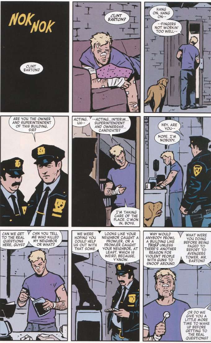
With this issue, David Aja returns to be Fraction's partner in crime.  And what a partnership!  Aja's style is simplistic but never simple.  Stylized but not annoyingly so.  Colorist Matt Hollingsworth also contributes to the proceedings, utilizing a muted palette that leaves everything looking softer and more realistic.  The one exception to this is the bright costumes of the superheroes besides Hawkeye and the various shades of purple that seem to surround Hawkeye no matter where he goes.  The complete effect is something unique and memorable.

It's been said before and it will be said again for as long as this book is around: Hawkeye is one of the best books on the market and a must read for all fans of good comics.

Saturday, November 24, 2012

Hawkeye #4 - A Review

Hawkeye #4 switches out artist David Aja for Javier Pulido to no ill-effect.  Pulido's style can only be described as Kirbyesque but not in the usual way that word is used.  Pulido's layouts are effective in their simplicity, with lots of close-ups on the characters who are speaking, as they look out directly toward the reader.  I'm not familiar with Pulido's previous work, so I don't know if the style is an artistic affectation for this story in particular or if he was chosen to draw it because of his regular style.  Regardless, it's an effective choice given that the basic story concept would not be out of place in a 1960's Nick Fury comic.


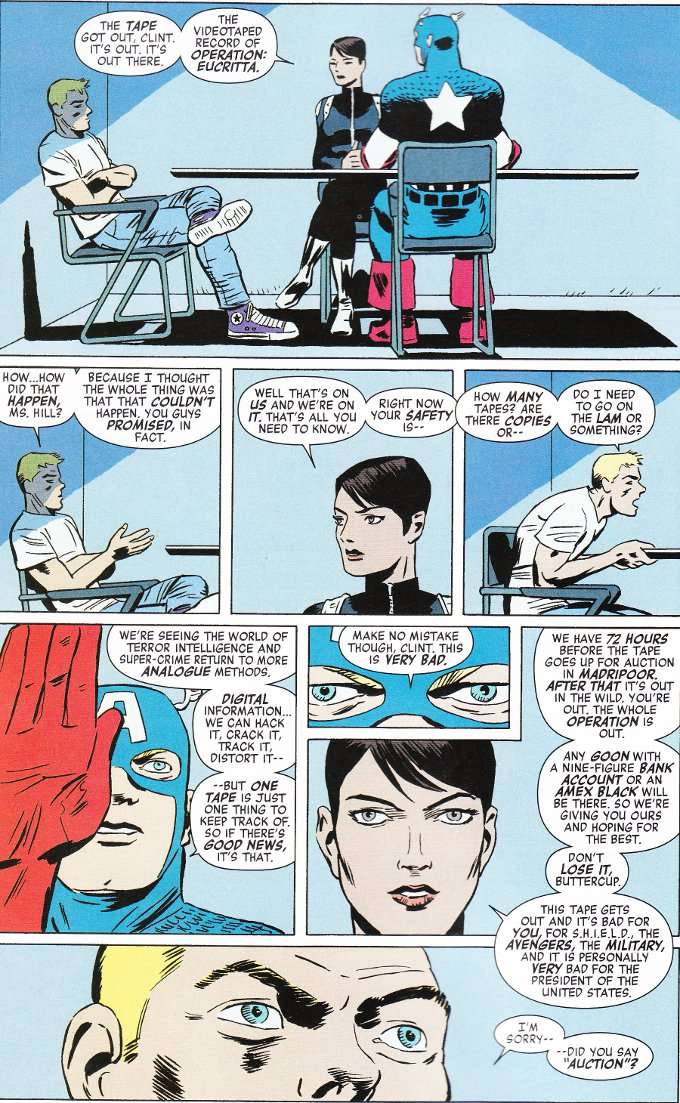
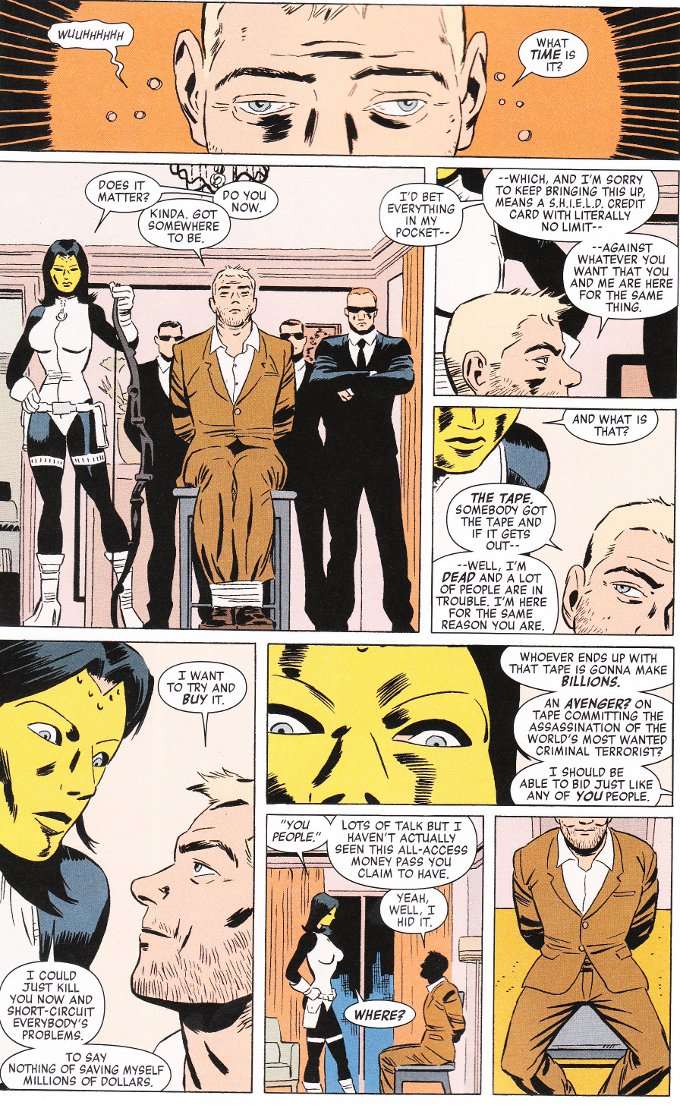
Matt Fraction's script however, despite having all the trappings of a Nick Fury comic or even a James Bond novel, reads like a modernized satire of those stories. (Try as I might, I can't recall James Bond ever forcing the SPECTER agents who captured him to give him a cavity search.) The plot, such as it is, focuses upon a mysterious video cassette.  And what is on this tape?  Nothing less than footage of Hawkeye, in costume, assassinating the world's most wanted terrorist on orders from SHIELD! With the reputation of The United States Government, The American Military, SHIELD, The Avengers and Clint's own life on the line, he has numerous motivations to make the journey to exotic Madripoor to try and buy the tape at auction.  But there are numerous villains who are interested in the tape as well and Clint with have to outwit them all with all the cunning, bravado and sarcasm he can muster.


All of this is gloriously funny and well-paced with a surprise on the final page that makes the book worth the reading, even if one isn't  a fan of superheroic send-ups and spy-game satires.  Gorgeous graphics abound throughout.  Truly, this is the best comic on the market involving an archer hero who doesn't really seem to do that much archery.

Friday, November 9, 2012

Hawkeye #1-3 - A Review


It was inevitable, in the face of the blockbuster success of The Avengers movie, that every character in that movie who did not already have their own comic would get one.  This presented a unique set of problems for Hawkeye.  For all of the things The Avengers movie managed well, their treatment of Hawkeye was not one of them.  He didn't have much chance for character development compared to the rest of the ensemble cast.  And what little development he received didn't develop him past the level of generic bad-ass. 

While this fit the Ultimate version of the character well enough, it did a disservice to original Hawkeye.  The Clint Barton who was raised by carnies, trained as a thief and was far too undisciplined and disrespectful of authority in general to ever cut the mustard in a military organization like SHIELD.  The Clint Barton who was a good guy but was also a smart-ass, a risk-taker and very much a non-generic bad-ass.

How then do we reconcile the two versions of this hero, when The Powers That Be at Marvel are pushing the Ultimates versions of the characters as much as possible in the popular media and the Ultimate Universe, in the comics at least, is largely played out?  If you're Matt Fraction, the answer is obvious - you write the best damn Green Arrow comic ever!

Hawkeye was recommended to me as "the best Green Arrow comic in years".  And that's as fair a summary of it as I can think of.  The hero we see here is less like Clint Barton and more like Oliver Queen as written by Kevin Smith.  That proves to be a pretty good character choice, as this book is something that's been all too rare in the Marvel Universe in recent years - fun.

Even the opening scrawl at the start of each issue is humorous, admonishing the reader by Issue 3, asking them why they are continuing to read the book's introductory concept when it hasn't changed.  Clint Barton a.k.a. Hawkeye became the greatest sharp-shooter known to man.  He then joined The Avengers.  This is what he does when he's not being an Avenger.  And what is it that he does?  Be awesome! 
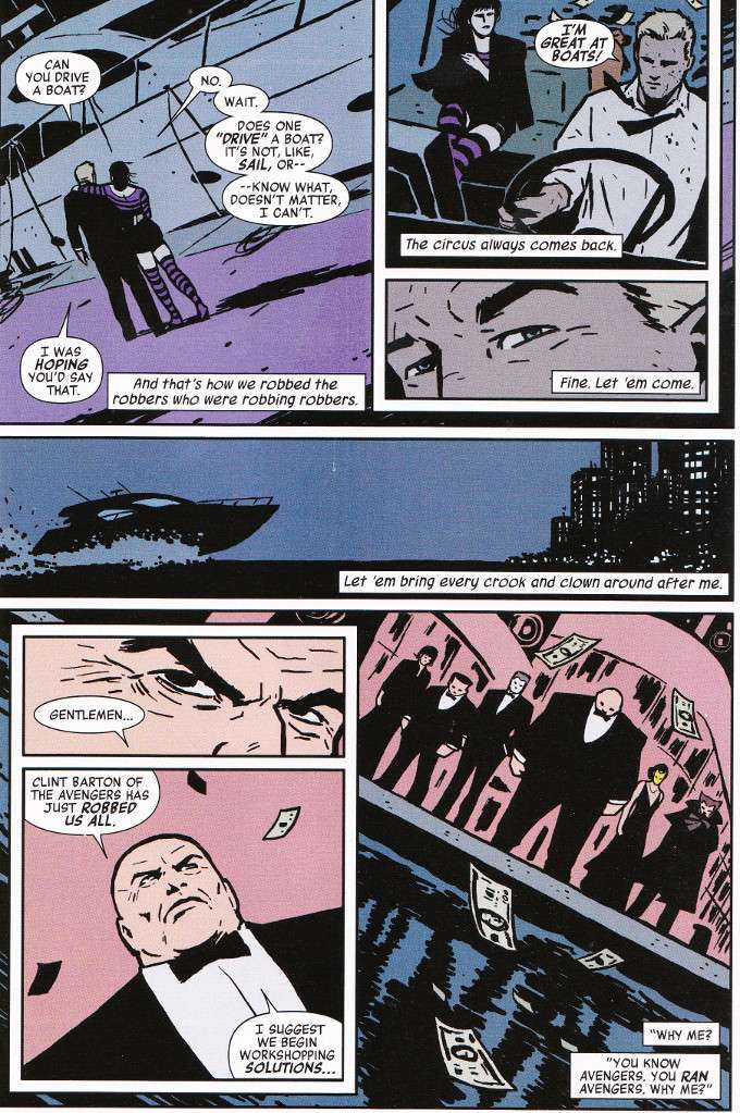

The first issue introduces Clint as something of a social-crusader, as he goes up against the Russian mobsters who own his apartment complex when they elect to evict everyone in the neighborhood.  The second issue gives Clint a sidekick in the form of Kate Bishop (a.k.a. the young lady Hawkeye from Young Avengers) and ends with him having thwarted a robbery by the revamped Circus of Crime (which has more of a Cirque Du Soleil feel to it now) by stealing the money they already stole, which belonged to several criminal scumbags.  The third issue details a typical day for Clint and all the complications that arise as he tries to get his gear organized, get some Scotch-tape, get a car, get laid and not get killed - not necessarily in that order.
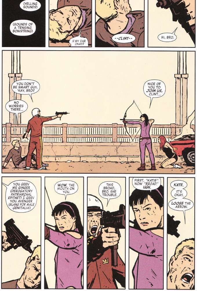

All of this is amazingly illustrated by David Aja and Matt Hollingsworth.  Aja's pencils are reminiscent of Alex Maleev's work on Daredevil but cleaner and less heavily inked as befits a brighter, more cheerful title like this.  Hollingsworth's palette further enhances the art, rendering everything in muted pastels for the most part, save for the shockingly vivid purple that both Clint and Kate favor in their clothing.

I'm not sure how the old-school Hawkeye fans will feel about this title but as a comics-reader in general, I liked it.  Fraction does a perfect job balancing the humor and the action.  The artwork perfectly matches the feel and attitude of the book.  All in all, it's a fun little read.  I'd recommend it to anybody who enjoys high adventure, stories about down-to-earth superheroes and anyone with a twisted sense of humor.

Wednesday, February 8, 2012

Daredevil: Reborn - A No Flying No Tights Review

SOURCE: Daredevil: Reborn


Blinded as a child by an accident that exposed him to radioactive chemicals, Matt Murdock was empowered by those same chemicals and gifted with enhancements to his other four senses that more than made up for the loss of his sight. Obsessed with justice after his father’s death at the hands of gangsters, Matt would grow up to become a lawyer and fight crime as the vigilante Daredevil. But all that is behind him.

Having abandoned New York City following the latest in a long line of difficulties, Matt Murdock is a man on the run. From the law. From his enemies. From his own past. When his wanderings lead him to a small town in the American Southwest, it doesn’t take a blind man to see that the sheriff is crooked and the local land baron/gang leader Calavera is the real law in town. With his own life and liberty threatened, Matt would be content to move on and leave the town behind. But when he learns that innocents are endangered, including the blind son of the former sheriff, Matt will have to choose between the peaceful life he longs for and the heroic destiny he’s long denied.

Author Andy Diggle is an old hand at this kind of high-action story with low-powered superheroes and his Green Arrow: Year One is a personal favorite of mine. One thing I must note is that this volume is a wonderful jumping-on point. Unlike many recent Marvel Comics, this volume is easily accessible to new readers who might not have read a Daredevil story before. This was something of a relief to me, as I hadn’t read Daredevil for several years myself and wasn’t up to speed on current events.

The plot is fairly standard stuff but Diggle makes it seem fresh and new. With the Southwestern background, a boy in need of a hero, and a story based around Murdock’s internal conflict between a desire for normalcy and his personal sense of justice, comparisons to the classic western Shane are inevitable. But Diggle’s tale avoids any clichĂ© romance with the blind boy’s mother. And Matt’s final battle against the corrupt forces running the town come down to the battle of one man against many rather than a war between two factions.

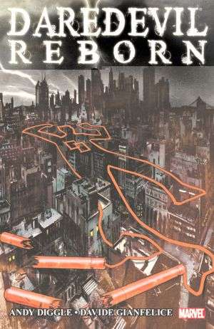
Many Daredevil artists drown their artwork in ink, trying to physically convey the literal and figurative darkness of Matt Murdock’s world. This style is one of the hallmarks of long-time Andy Diggle collaborator Jock, who produced the cover art that separates each chapter of this volume. The cover of this trade paperback is particularly noteworthy – a glorious piece which depicts the slums of Manhattan in black and grey, the darkness broken only by white-hot lightning strikes. Above it all, traced with Daredevil’s famous custom nunchucks, lies the outline of a dead man.

While Jock’s style would be effective for a story set in the alleys of Hell’s Kitchen, it might be ill-suited toward a story set in the American desert and interior artist Davide Gianfelice is wise enough to limit his own inks accordingly. With the character-design skills of John Romita Jr. and a style that evokes Michael Lark without being quite so muddy, Gianfelice was a good choice to handle the pencils and inks of this book. Colorist Matt Hollingsworth also deserves praise for his choice of palette.

One content note – this book earns it’s T (13 and Up) rating. There’s a goodly bit of ultra-violence, bloodshed, and some subtle language indicating that the former sheriff’s widow has turned to prostitution to make ends meet. Still, there’s nothing that I believe would mark this volume as unsuitable for most teen graphic novel collections.

Daredevil: Reborn
by Andy Diggle
Art by Davide Gianfelice, Matt Hollingsworth
ISBN: 978078515133
Marvel Comics, 2011
Publisher Age Rating: T (13 and Up)