Showing posts with label Tomeu Morey. Show all posts

Thursday, November 2, 2017

Batman: The Devastator #1 - A Review

The Dark Knights continue to carve their way across Earth Zero. The Knight known as The Devastator - a Batman who turned himself into a monster born of Kryptonian science to stop the corrupted Superman of his world - is about to pay a visit to Lois Lane and make his mark on Metropolis.


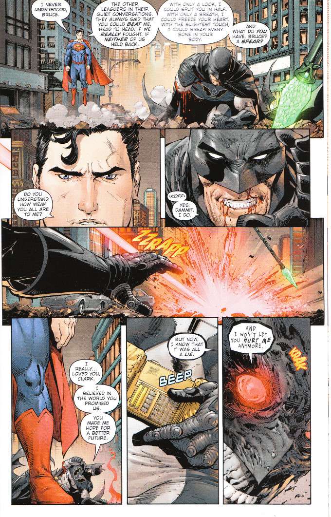
If nothing else was accomplished by Batman: The Devastator #1, it gave me a new level of respect for Frank Tieri and James Tynion IV. I shan't spoil the hows or details but the flashback sequence detailing the creation of The Devastator puts a nail in the coffin of the idea that Batman would easily beat Superman in a fight given enough time and resources. Emphasis on the word "easily". The artwork by Tony Daniel and Danny Miki proves equally impressive, being vividly detailed yet smoothly presented.

The Final Analysis: 10 out of 10. A Must-Read for all fans of Superman and Batman. 

Monday, October 30, 2017

Detective Comics #967 - A Review

Tim Drake has freed himself from the inter-spatial prison of Mr. Oz. The bad news is that Tim's counterpart from a dark future where he becomes Batman has also escaped into the modern era and he's determined to avert his future by killing the woman responsible for making him become Batman... Kate Kane!

Now, all of the Knights - Tim's name for Batman's team that he's amazed nobody else thought of using before - must stand against a Batman armed with all of Tim Drake's intelligence, technology from twenty years in the future and no qualms about killing.


There's little I can say about this issue I did not already say about the previous chapters of A Lonely Place Of Living. Suffice it to say that James Tynion IV has outdone himself on the script for this story and any fans of the Titans Tomorrow arc from Geoff Johns' Teen Titans will want to check this out. The artwork equals the story in intensity and the only reason not to read this comic if you're any kind of Batman fan is if you're waiting for the trade to get it all in one glorious big gulp.

The Final Analysis: 10 out of 10. 

Thursday, December 31, 2015

Superman Annual #3 - A Review

There's two good comics contained within Superman Annual #3. One details the new origin of the immortal conqueror Vandal Savage, tying his origins indirectly into the Superman mythos.  The other showcases the problems Clark Kent faces as he continues to try and help people as Superman, despite his waning powers, lack of a secret identity and Lex Luthor running Justice League.

Unfortunately, these stories ultimately exist only as a set-up for the latest big crossover. And that proves to be to their detriment. It's apparently not enough to tell a story which shows that the meteor that empowered Vandal Savage came from a comet that was redirected from Krypton. We can't just tell a story where Clark Kent tells a teary-eyed Lana Lang that he can't just quit being Superman, even without his powers. It's all just build up for yet another excuse to boost sales.


It's a shame because there's some truly great writing on display in this issue.  The Vandal Savage story is just plain fun. And the modern story proves the point that what makes Clark Kent Superman isn't his powers - it's his ability to inspire other people to greatness. It also subtly disproves Lex Luthor's postulation  - that Superman's existence will cause common people to stop striving to be better - as Lex begins exploiting his power and authority to keep Clark Kent from trying to advance himself. Rarely has Luthor's evil and Clark's goodness been so well and simply exemplified.

The artwork, sadly, isn't quite so evenly handled.  The artwork for the Vandal Savage story is grand, showing a good deal of variety as we follow Savage through the ages.  The artwork for the Clark story, while skillfully done, utilizes a gritty, more realistic style that doesn't really seem appropriate to the story at hand.
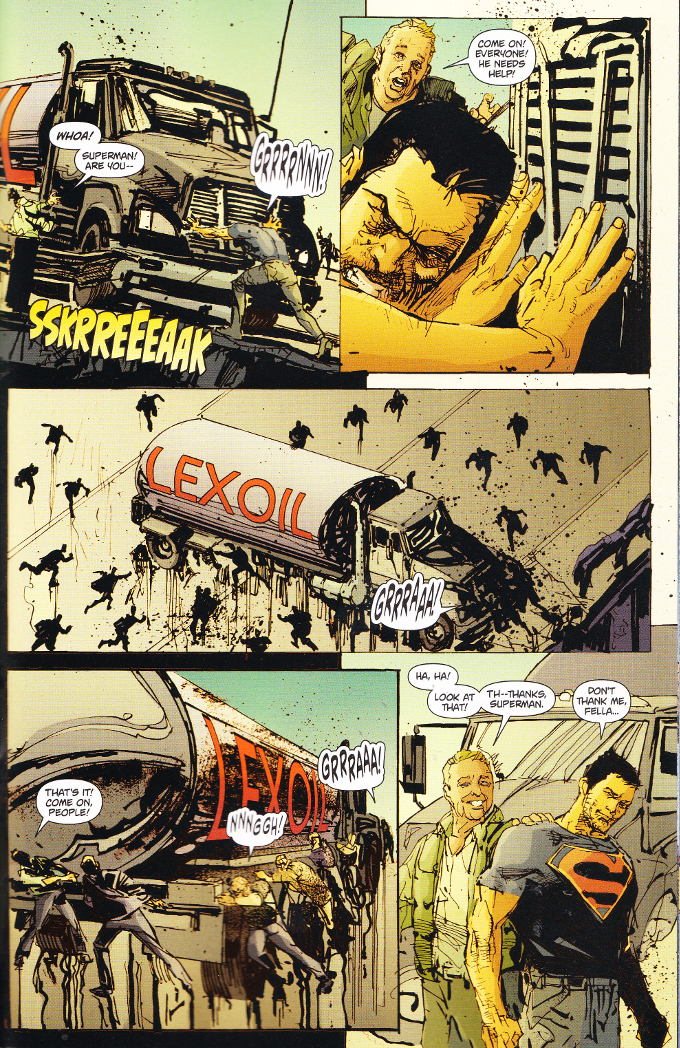


Superman Annual #3 is a model for everything that is right and wrong with DC Comics since the New 52 revamp. There's a number of brilliant innovations and reimaginings of classic concepts and this comic showcases the ideal that the hero aspect of a character is more important than the super one. Yet all of that is undercut by a relentless grittiness that is grim for its own sake rather than to make the light shine brighter and the fact that this story exists only as introduction to yet another sales gimmick.

Thursday, July 30, 2015

Superman #42 - A Review

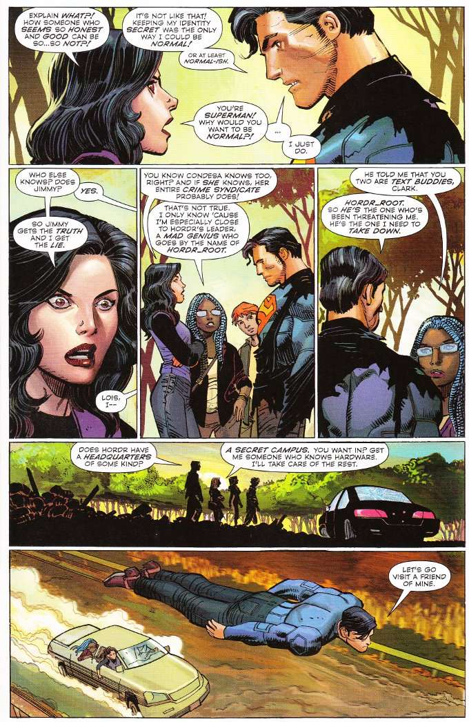
Lois Lane has finally put two and two together and uncovered Clark Kent's secret identity. But even in the face of Lois' trust being shattered, the two have bigger problems. For a hacktivist called HORDR_ROOT has also uncovered the truth of who Superman is and has plans to recruit The Man of Steel for his organization... or else!


I feel conflicted about Gene Yang's script for this issue. On the one hand, the idea of HORDR_ROOT is a novel one and the idea of an enemy who utilizes the power of information against Superman is a novel one. Sadly, the threat he presents is resolved far too quickly.

A larger problem is the character of Lois Lane, who - in the New 52 universe at least - lacks the closeness to Clark that is required to sell the feelings of betrayal she expresses here. The whole thing rings false but I fear that's more the fault of editorial demand than Yang's script, because otherwise the character interactions are wonderful.


The artwork inspires similar feelings of conflict. The pencils and inks by John Romita Jr. and Klaus Johnson are up to their usual high standard, but there's nothing in the issue that stands out as particularly fine work. The greatest problem is the color art, provided by three different colorists with distinctly different styles and palettes.  Just look at the tone of the characters' skins and you'll see the obvious disparity, with the characters appearing pale in one panel and ruddy-cheeked in the next!

Wednesday, June 11, 2014

Batman Eternal #9 - A Review

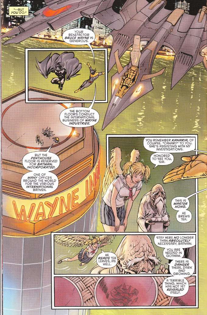
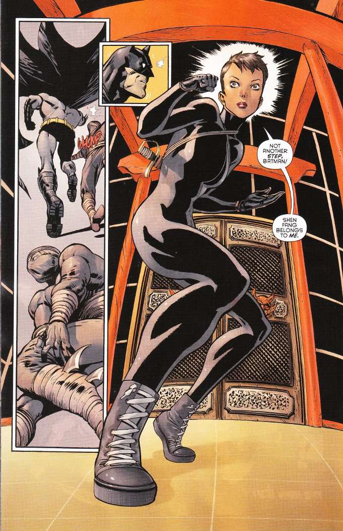
Batman Eternal #9 finds The Caped Crusader leaving Gotham City for a time.  With the GCPD out for his head, Batman decides to head to Hong Kong and track down the crime bosses who assisted Carmine Falcone during his five years in exile.  He is assisted in this endeavor by Batman Incorporate's agent in Japan.  At the same time back in Gotham, Catwoman begins planning her own strike against Falcone.


After reading this issue, I want to see more comics with the Japanese Batman.  It's just such a cool concept to have a Batman flying around Tokyo and that his sidekick should be a flying schoolgirl called Canary.  I know, I know... just get Dinah in there for an issue to give her some martial arts training and we'll have something awesome.


I slammed Guillem March's artwork pretty hard in my review of Catwoman #1 but there's nothing at all bad about it here.  Perhaps the previous focus on Selina Kyle's anatomy was due to the script and not the wandering eye of the artist?  Regardless, there is no odd male-gaze in the artwork in this issue despite the main female characters being clad in skin tight leather or school girl uniforms and the fight choreography is well played out.  Even the colors of Tomeu Morey don't seem so grating in this issue, where the oddly bright coloration actually fits the setting.

Monday, June 2, 2014

Batman Eternal #8 - A Review

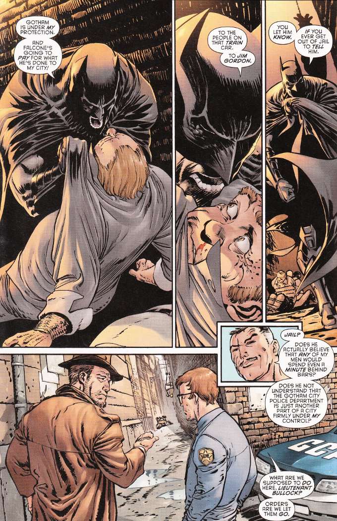
Batman's war with mobster Carmine "The Roman" Falcone continues to take center stage in this week's issue of Batman: Eternal.  It is a war that Batman doesn't realize he is losing, as unbeknownst to him - but knownst to us - the new Police Commissioner is in Falcone's pocket.  Worse, he's instituted a new policy of refusing to arrest any criminals Batman brings down.


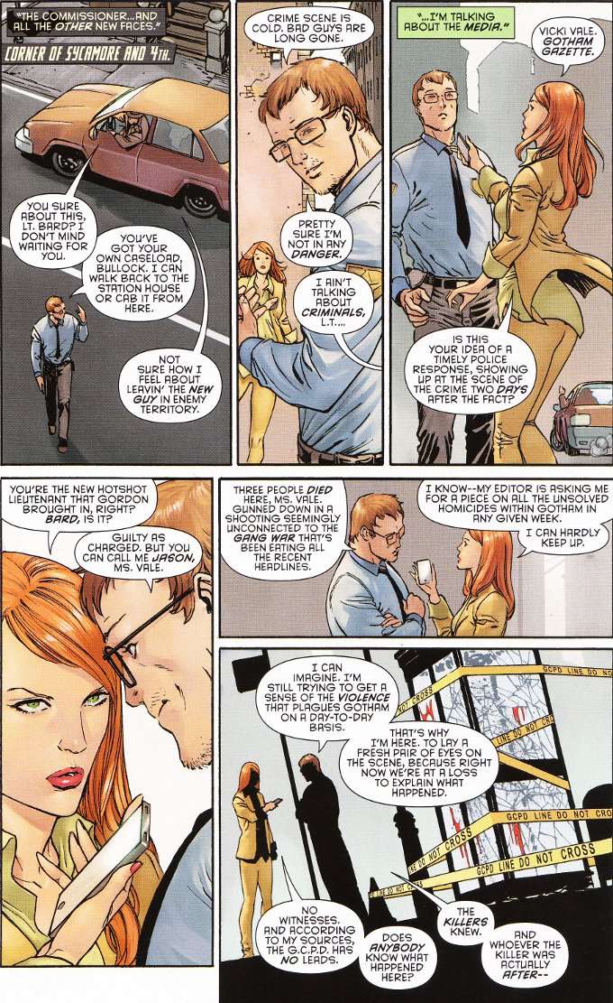
The script by John Layman does a good job of balancing multiple subplots that mix and mingle throughout the issue.  Vicki Vale - still pursuing her story from several issues early - runs into honest cop turned flummoxed rookie Jason Bard and the two interact for a bit before getting on with their respective bits of business.  But it isn't all interaction and the issue concludes with the series' most thrilling action sequence to date.


The artwork by Guillem March seems reminiscent of the early works of Todd MacFarlane in terms of design and detail.  Some sections seem a little rushed but the pencil-work is largely excellent.  The only real flaw to the artwork is the washed out palette, full of dirty browns and greys, used by colorist Tomeu Morey.  Even the blue of Jason Bard's uniform looks more grey than blue.