Showing posts with label David Lopez. Show all posts

Saturday, March 12, 2016

All New Wolverine #6 - A Review

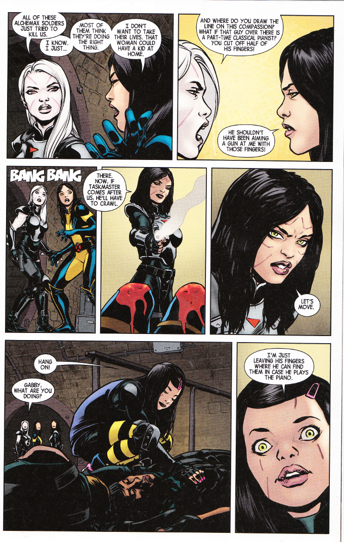
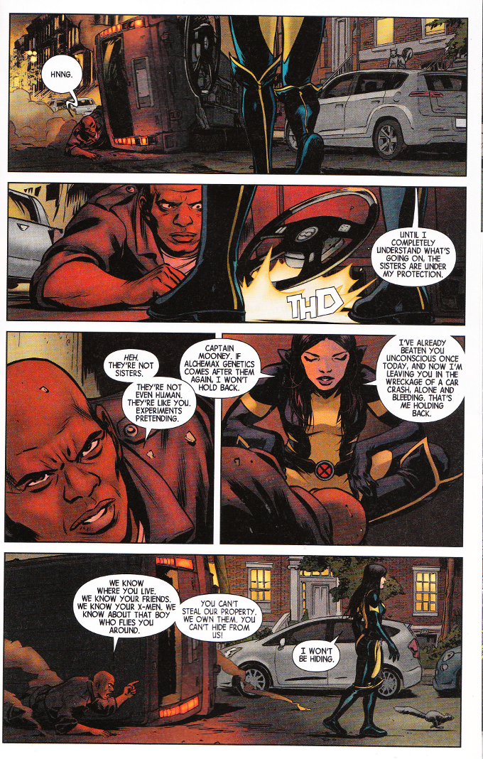
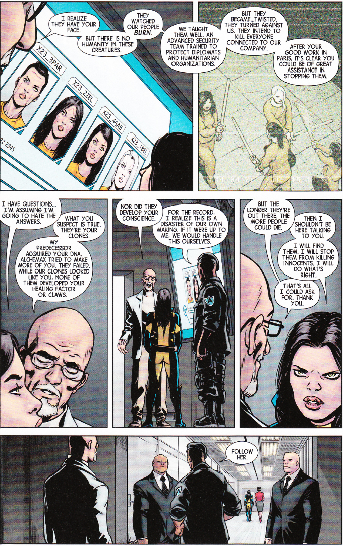
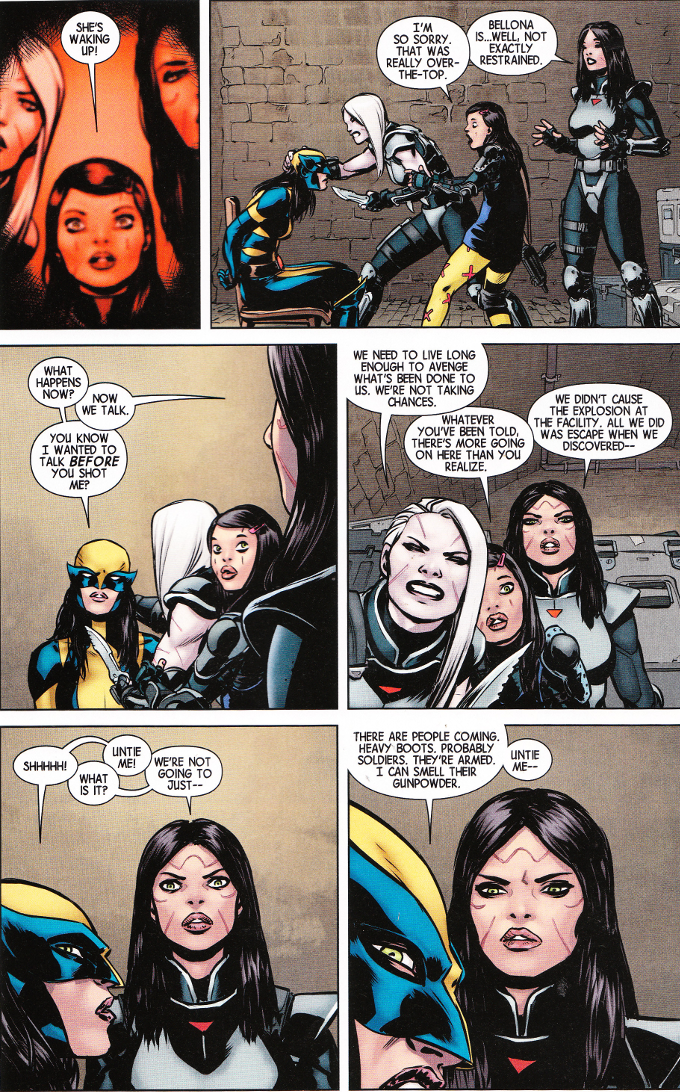
Laura Kinney - now called Wolverine - was astonished to find that she had "sisters". Clones made by the sinister Alchemax Genetics, altered to have no sense of pain and grown to be disposable assassins. Now, with one of the sisters dead, the girls are out for revenge. But will Laura be able to maintain her vow not to kill in the face of such evil?

This issue proves a perfect conclusion to a wonderful opening arc. As I've said before, I've never been a big fan of Wolverine or the former X-23 but I'll give anything by Tom Taylor a shot. And I'm glad I did, because this series has been full of Taylor's trademark dark humor as well as some amazing action sequences.


The artwork, as usual, proves epic in scope. David Lopez and David Navarrot are a highly underrated art team who deserve an Eisner Award for their work here. The color art by Nathan Fairbairn is equally impressive.

Monday, February 15, 2016

All New Wolverine #5 - A Review

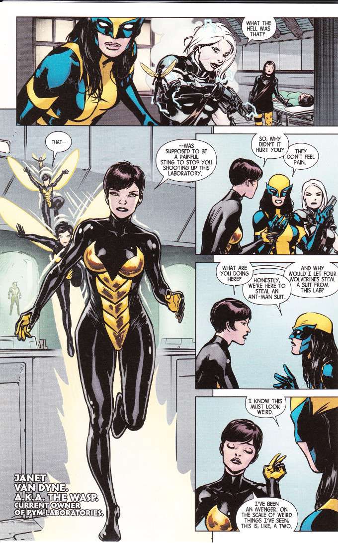
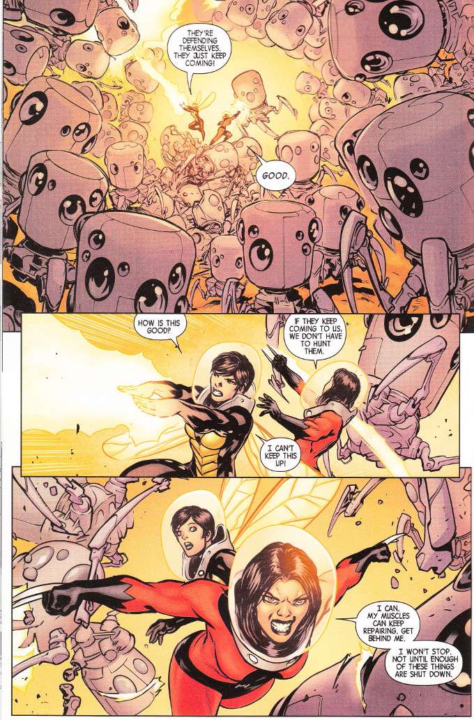
The hunt for a cure for her "sisters'" condition leads Wolverine to Pym Labratories and an ill-advised attempt to steal an Ant-Man suit. Thankfully, The Wasp is sympathetic to the girls' plight and willing to help fight the nanintes that are threatening to tear them apart from the inside. Unfortunately, that's a task that's easier said than done.


I've never been much of an Avengers fan but I've always liked the spunky, confident, take-charge take on Janet Van Dyne from what modern Avengers comics I've seen as well as her characterization in the Earth's Mightiest Heroes cartoon. Tom Taylor's take on The Wasp is woven of the same cloth and it's nice to see her in action here. It's also nice to see that Laura is marked as being a distinctively different fighter than Logan, taking care to plot some strategy before cutting loose.


The art team continues to impress.  David Lopez and David Navarrot continue to nail it out of the park with every page. And Nathan Fairbairn's colors are perfectly chosen throughout.

Saturday, January 16, 2016

All New Wolverine #4 - A Review

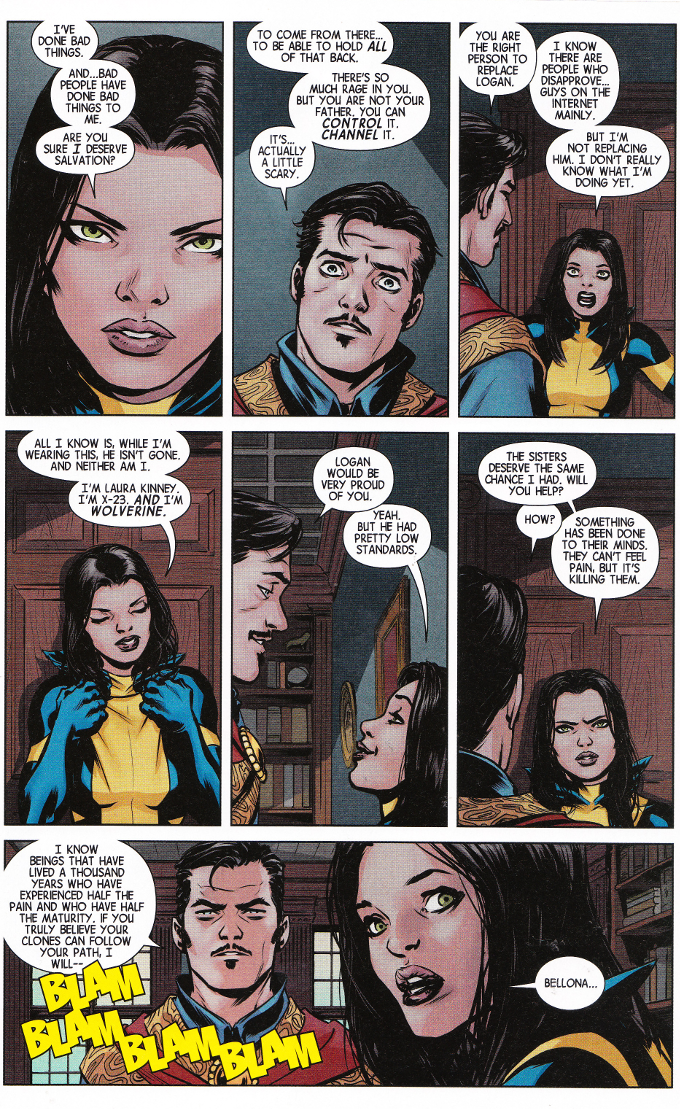
Wolverine needs a safe place to hide herself and her three "sisters".  And there's few places safer than the home of Doctor Strange, at least when it comes to mundane menaces. But opening the wrong doors can unleash terrible things...
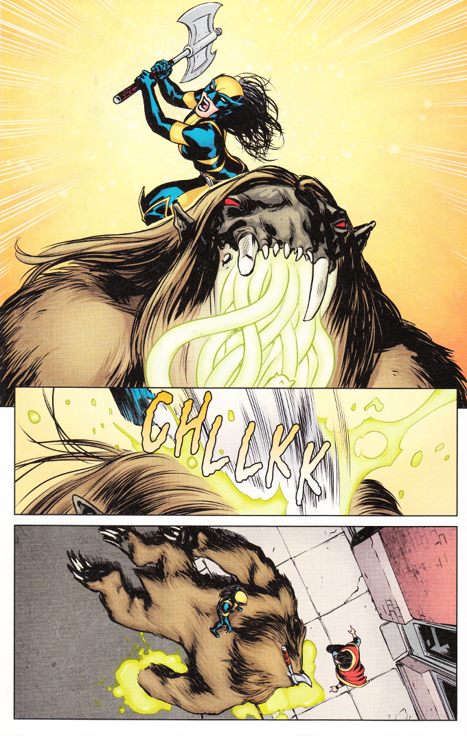
Despite one of my favorite comics mini-series of all time being the Giffen/DeMatties/MacGuire Defenders, I still don't think of Doctor Strange being a comedic character. Then again, I never really thought about Wolverine - Logan or Laura - being funny characters until Tom Taylor got his hands on them. This may be the most uproariously funny issue of this series so far yet it is also the most touching and the most action-packed. This book has the perfect balance of ethos, pathos and hilarity as well as ax-wielding berserk young women killing monsters.

Taylor is backed by an excellent art team. David Lopez and David Navarrot deliver their usual stellar work on the pencils and inks. And Nathan Fairbaim finishes things beautifully with his color art.

Thursday, December 31, 2015

All-New Wolverine #3 - A Review

Laura Kinney's first mission as the new Wolverine isn't off to a stellar start. While she successful stopped an assassination attempt, she also discovered the assassin was a clone like her.  As in, exactly like her!

Now Laura has uncovered the clone's "sisters" - all part of the same batch created by the sinister Alchemax Genetics. But Alchemax wants their rebellious property back. And while Laura can handle herself in a fight, it remains to be seen if she can cope with three equally strong-willed young women who don't share her desire to avoid killing.
I don't usually associate humor with Wolverine as a title but I do associate it with the writing of Tom Taylor. There's a wit to all of Taylor's writing that is unique and it's adapted quite well - scarily so - to the darker tone this series requires. This is not to say that things are all laughs. Far from it! There's plenty of action as well as some general badassery.  Overall, the tone is sharp and well-balanced, like a katana.
The artwork is just as good as the writing. David Lopez and David Navarrot are performing miracles on a monthly basis. And the colors by Nathan Fairbairn are well chosen and always thematically appropriate.

Saturday, November 28, 2015

All-New Wolverine #2 - A Review

Identity issues are part of the package when you're a clone. Yet Laura Kinney is experiencing a whole new range of odd emotions with the discovery that she has "sisters" - imperfect clones who lack her powers but have been granted a superhuman-tolerance for pain and a complete lack of empathy. Or so the scientists who created them claim. Of course Laura would be reluctant to kill these girls even without her suspicions there's more going on than is obvious. But will the trio of remaining assassins have the same qualms about sparing her if The Wolverine forces a fight?


Any fears that Tom Taylor might be forced to hold back on the humor while writing a dour, serious X-Title have proven totally unfounded. While not as uproariously funny as his work on Superior Iron Man, there are still some truly funny bits amid the action of this issue. And the action is top-notch as well!


Taylor's scripts are brought to life beautifully by David Lopez and David Navarrot. The character designs give each of the Laura Kinney clones a distinct look. There's no trouble telling who is who, even ignoring the differences in age and one of the clones being an albino.  It's a subtle touch but a nice one and it's good to see they didn't leave the characters' visual identity entirely in the hands of colorist Nathan Fairbairn.

Wednesday, July 3, 2013

Injustice: Gods Among Us #24 & #25 - A Review

I love this book.  No matter how uneven the artwork may be at times due to the rotating art teams, this is still a title I look forward to reading every week.  There's a few reasons for this but the chief one is that with so many cardinal rules of what should happen in a DC Comics storyline being broken as this story progresses it's almost impossible for me to guess what may happen next.  That's something that's largely lost in these days of Internet exclusives, Diamond Previews and superhero deaths being announced a day in advance on the cover of USA Today.

I can't deny there's an element of nostalgia behind my love of this book as well.  Though I've tried to be positive about The New 52 and have enjoyed some of the titles to come out of it, the vast majority of it leaves me indifferent at best and annoyed at worst.  No matter how much I might enjoy what Jeff Lemire does with his take on Green Arrow, it still doesn't change the feeling I have that Oliver Queen should have a beard and remind me of George Carlin every time he opens his mouth to point out the stupidity of the people around him.
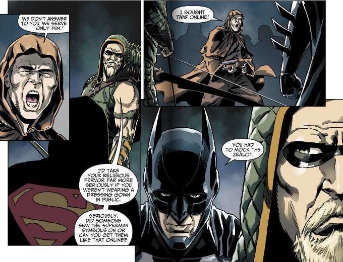

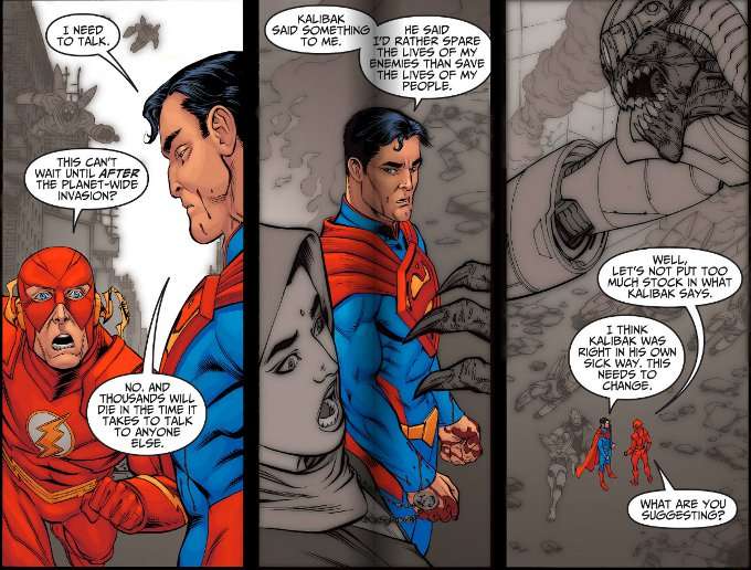
The irony is that in presenting us with this view of a dark future where Superman makes killing the bad guys his first attack rather than a last resort and a cult of Superman worshipers sacrifice petty crooks in the name of their savior, writer Tom Taylor also pays tribute to The Silver Age of Comics when such things would have been unimaginable.  There's lots of nods to the glory days of DC Comics, with Superman and The Flash having a conversation at super-speed in the midst of a battle.  You've got Green Arrow and Black Canary as a couple again, kissing one last time in the face of what they think is certain death.  And I'm not sure precisely how Superman defeats all the Parademon hordes in Issue 24, save that it involves flying very quickly around the world.

As I said before, the art is this book's biggest weakness and it really would benefit from having a consistent art team.  At the very least, it would be better if the art teams rotated every few issues rather than every week.  Mike S. Miller - artist on Issue 24 - is a good artist whose simple designs lends themselves well to big, dynamic battles but tend to look somewhat silly in the smaller scenes of two characters just talking.

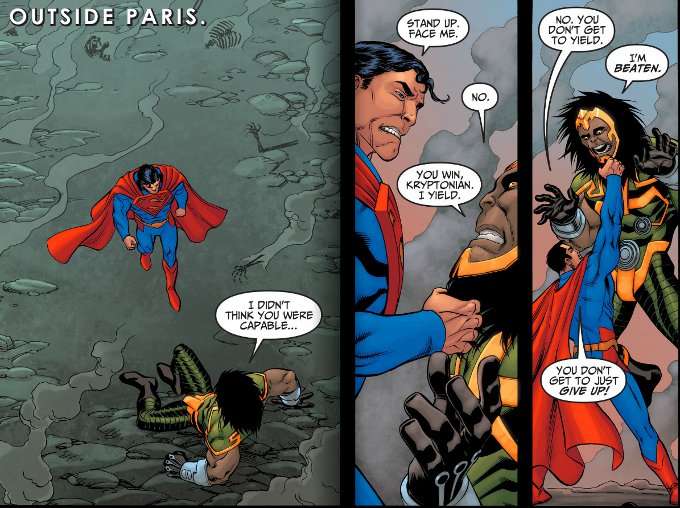
By contrast, Bruno Redondo seems to be capable of drawing everything well - action and conversation - in Issue 25.  Sadly, his artwork is ill-served by the coloring team.  The palette used by David Lopez and Santi Casas works against Redondo's inks.  This creates a washed-out, worn look that is completely at odds with Redondo's style.  Compare the work below to Redondo's excellent work on Injustice #5 and I think you'll see what I mean.
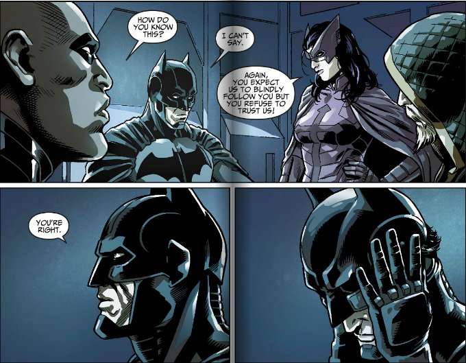

Despite all that, I still love this book.  Warts and all.  And barring some truly drastic changes, I'll be reading it until the bitter end.

Wednesday, October 10, 2012

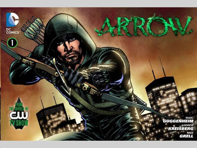
Arrow #1 (Web Comic) - A Review


Arrow #1 will seem pleasantly familiar to most Arrow-Heads.  The setting may be new, Star City having been changed to Starling City.  The supporting cast may be different, with the love of Ollie's life now being named Laurel rather than Dinah and Ollie - previously an only child and an orphan in all his previous incarnations - now having a living mother and a younger sister.  But the heart and soul of the Emerald Archer - everything that makes Oliver Queen unique as a character and a hero - all of that is intact and on display here.


The story of this issue offers few surprises, covering the same information fans have likely learned from the previews of the Arrow TV show and discussions with the show's actors and creators.  Newly returned to civilization after five years marooned on a deserted island, Oliver Queen struggles to put his life in order.  On the one hand, he has to fit in with the privileged high-society crowd he used to be a part of, for the sake of his loved ones.  On the other hand, he wants to honor his father's dying wish to make up for his mistakes and confront the evils that threaten their home town.. 

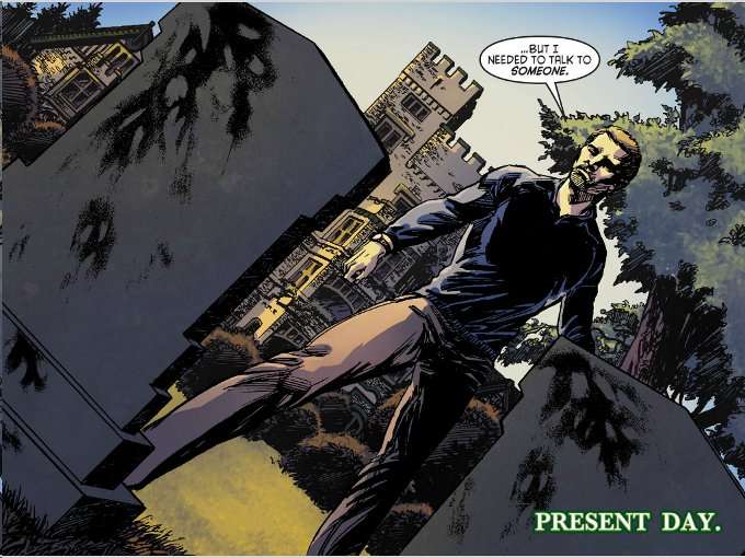
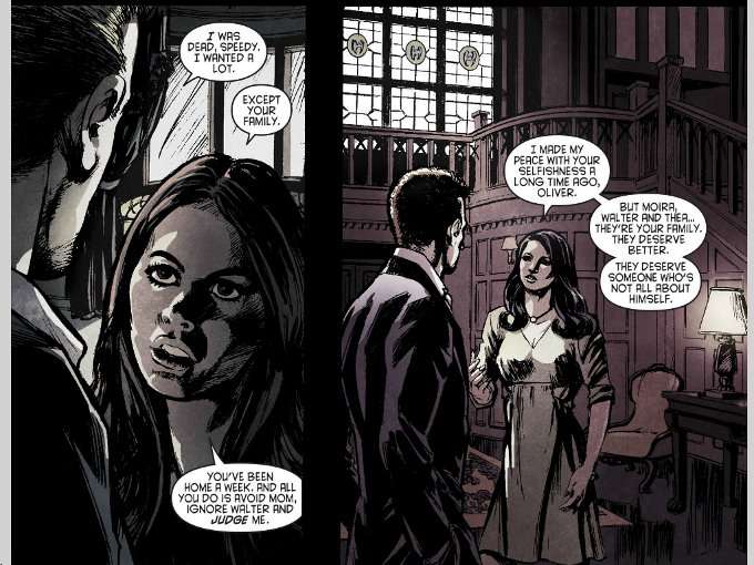
We don't get any reasons as to precisely why Ollie is having trouble fitting in again, apart from some vague talk about him being selfish and judgmental towards his family.  Thankfully, what the script by show creators Marc Guggenheim and Andrew Kreisberg lacks in detail it more than makes up for in pathos.  The scenes of Ollie talking to his father's grave and soliloquizing about his conflict prove quite effective, marking this version of Ollie as a cousin to Hamlet. Presumably we'll get more details about precisely why Ollie is clashing with his family and friends in the first episode of Arrow.  


Legendary Green Arrow author and artist Mike Grell handles the art duties for the entire issue and proves worthy of the title "legendary".  Though this issue gives Grell little chance to showcase his famous skills for illustrating action scenes, he does render everything in an appropriate manner.  Heavy shadows and angles where Ollie's face is obscured as he talks to the people he must hide his secrets from help to subtly emphasize the theme of deception and just how alone Oliver feels.  Colorists David Lopez & Santi Casas of Ikari Studio also help to emphasize the story's theme of isolation, using washed out colors in the scenes where Oliver deals with his friends and family while a brighter, more colorful palette is used in the outdoor scenes where Oliver is alone and relatively at peace. 

Bottom Line; this is the Green Arrow book DC Comics should have given us a year ago.  The artwork is all-around amazing and establishes its' mood perfectly.  The story establishes our protagonist's central conflict effectively though it does skimp on the details of his current circumstances.  Despite this, this issue does a great job of introducing Ollie as a character to new readers and establishes the base concept of the world effectively.  Highly recommended to Arrow-Heads, old and new.