
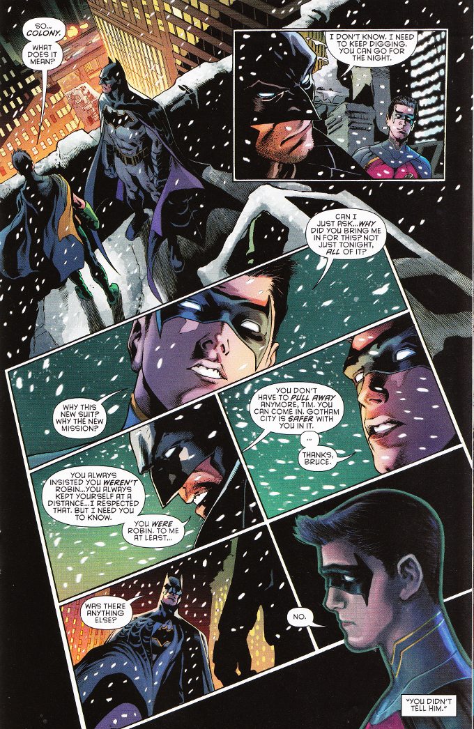
The focus of this issue is on Tim Drake and that is greatly to its benefit and the readers'. The relationship between Tim Drake and Bruce Wayne was one of the first casualties of The New 52 and it has never been clear just where the two stood with each other over the last five years. James Tynion IV explains everything here simply and quickly, catching-up new readers whilst satisfying those Bat-fans who fondly remember Tim Drake's days as Robin in the 1990s and 2000s.
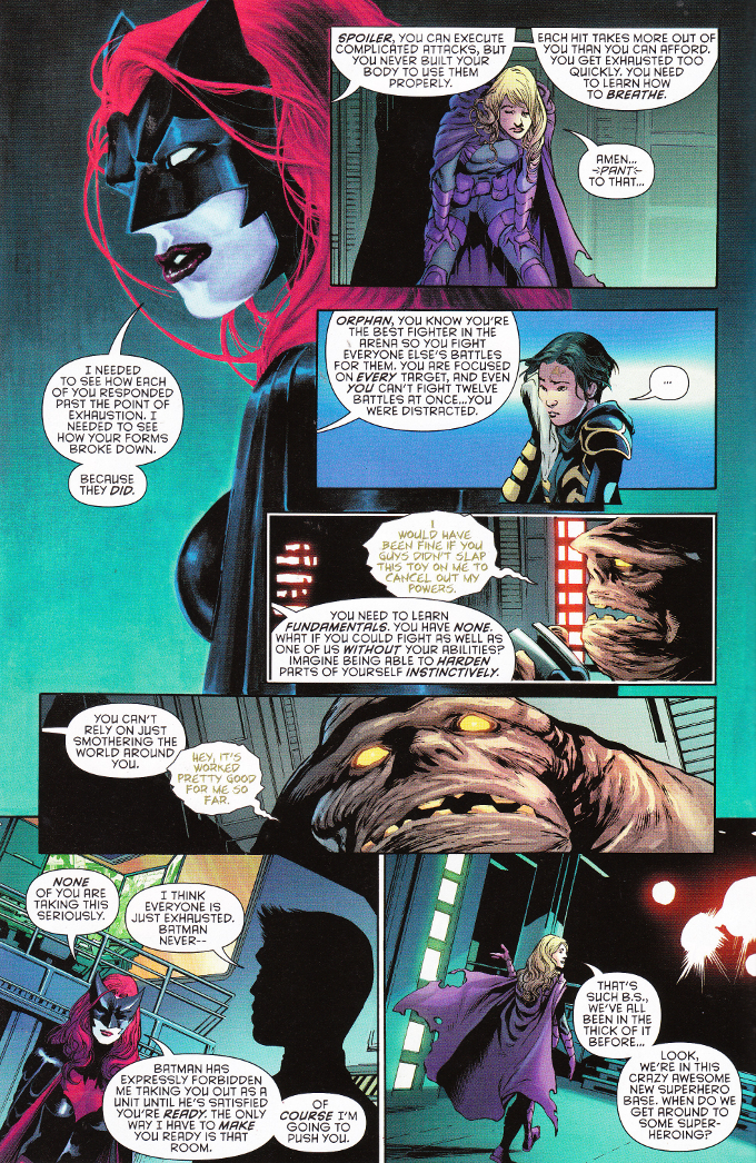
While the focus is on Tim, the rest of the cast get their moments in the sun as well. The complicated relationship between Kate Kane and her father from the Batwoman books continues to be explored and we get a few brief pages of Stephanie Brown and Tim Drake being a cute young couple that aren't worrying about their lives as heroes for a bit... even as Steph's sometimes roommate Cassandra accidentally butts in on their "us time". Even Basil "Clayface" Karlo gets a nice moment as he asks Tim, somewhat sheepishly, if it would be okay for him to take the device Tim created that locked him into a human shape to go out to an audition... purely so he can feel like his old actor self again for a few hours.
The artwork for this series thus far perfectly matches the scripts in quality and tone. Eddy Barrows is one of the best pencilers to work on the Batman books in years and Eber Ferreira's inks complete his work wonderfully. There is a nice effect - I assume it is the work of colorist Adriano Lucas - in which several portraits of the characters have a somewhat muted look that contrasts with the more sharply defined panel work. This softer edge is quite striking, ironically standing out all the stronger amid the more focused artwork in the panels.
No comments:
Post a Comment