
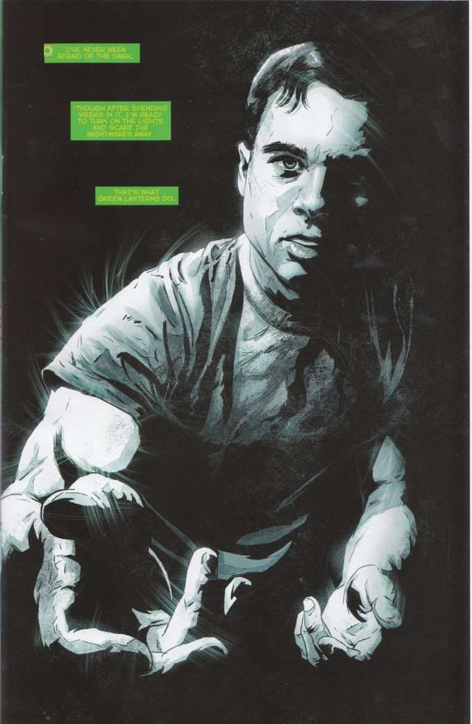
Johns' explanation is a fair one and the drama here is well-played, as one would expect with a Geoff Johns story. However, readers are more likely to be enraptured by the atmospheric artwork of Szymon Kurdanski and colorist Alex Sinclair. Can one properly be called a colorist when working in a monochromatic scale? That's a debate I'd rather not be a part of. All I know is that the black-and-white imagery used to portray "The Dead Zone" is some of the most interesting I've seen in recent memory.
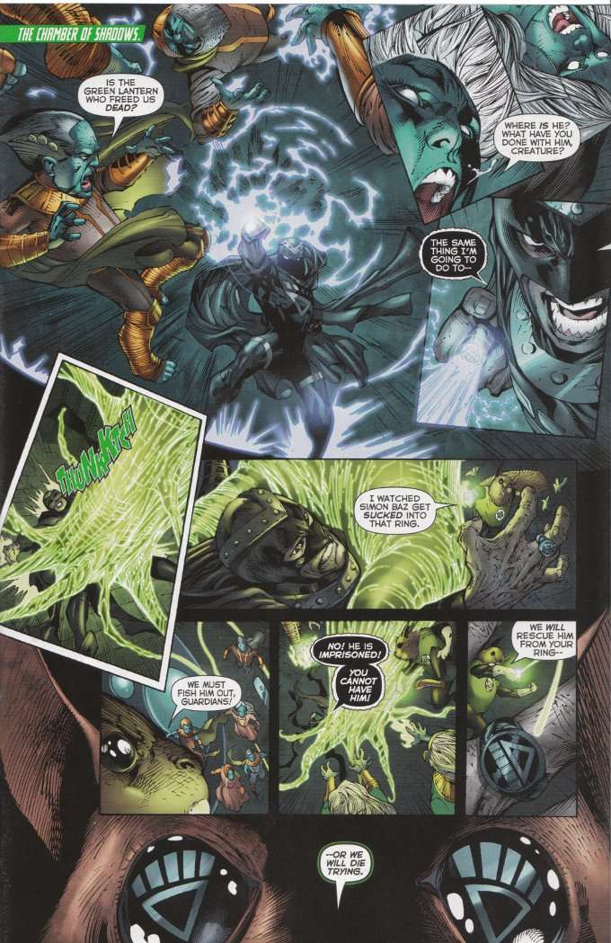
The artwork in the other sequence, where The Guardians fight Black Hand, is more problematic. I've enjoyed Ardian Syaf's work on Batgirl before but his work here seems oddly off-model. The panels seem to cramp the action rather than displaying it and these sequences suffer as a result. It doesn't look bad. It just looks tiny in a book where everything should be larger than life.
Green Lantern #18 is an enjoyable read but it's not a good first issue for those who haven't been reading the Green Lantern books already. If you have yet to discover Geoff Johns' Green Lantern, I'd suggest tracking down a TP of Green Lantern: Rebirth and starting from there.
No comments:
Post a Comment