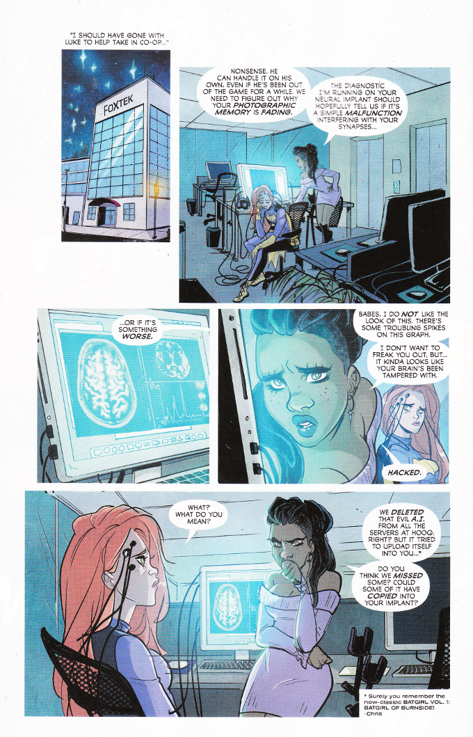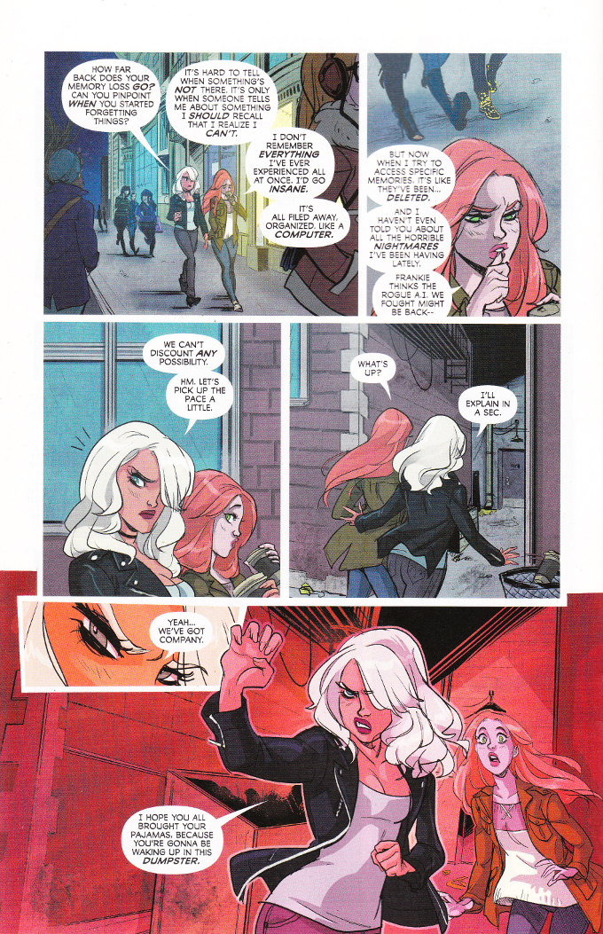
I wish Batgirl was written like this on a more frequent basis. There's not a lot of chaff in Fletcher and Stewart's script this time around. And I'm in favor of anything that helps to explain away Barbara's out of character behavior.

Alas, it seems that this month it is the artwork's turn to be uneven. With two different artists working breakdowns and two colorists, there's not a lot of uniformity. None of it looks bad, persay, but the sudden shifts between Tarr's sketchy breakdowns and Rob Haynes thicker inks coupled with the brighter palette used by Lapointe conflicting with the more neutral one favored by Loughridge make it hard for the book to maintain a consistent visual tone.

No comments:
Post a Comment