
For those who aren't familiar with Ed Benes and his oeuvre, Mr. Benes is an artist who specializes is a style that has earned him a certain amount of derision. It is not that Mr. Benes is incapable of drawing male characters or action scenes. It's just that he's rather more famous (and infamous) for his covers and posters featuring female characters in a pin-up style.
To give you some idea, here are two of Mr. Benes' previous works involving Red Sonja.
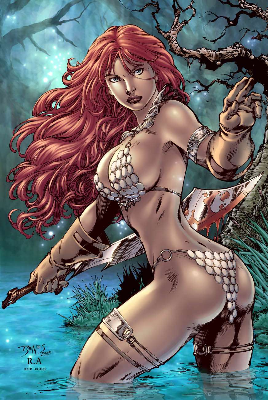

She looks... cheeky.
Ed Benes did the main covers for every issue of Red Sonja/Conan and, if I may be charitable, they have not been his best work. Even ignoring the cheesecake angles in the above artwork and the unlikeliness of Sonja posing thus while in the middle of combat, at least it looks like she is holding her weapons properly with her feet firmly planted, Not so in this cover, where it appears that Sonja is lying on her left side while still being upright, her sword arm twisted at a weird angle. Conan's stance with his dagger twisted around the wrong way in his right hand is little better, looking equally off-balance and forced.
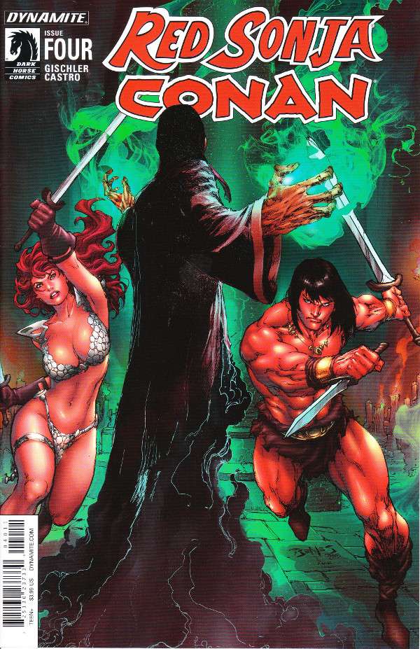
Seriously. Put Sonja on her side and picture her saying "Draw me like one of your Aquilonian girls".
I mention all of this to lend you perspective when I reveal a frightening fact.
This - all of this which you've seen before this sentence?
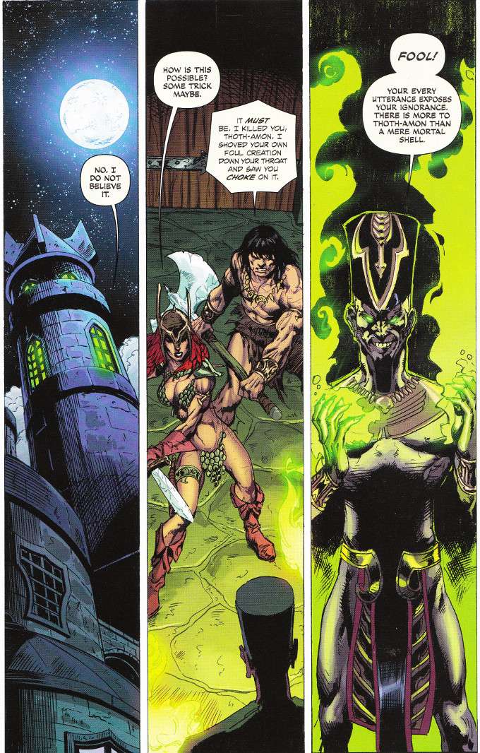
It is better than any artwork in this book's interior.
Has anyone reported this to Eschergirls yet?
Yet even this is not the worst aspect of this comic! The grim irony of Red Sonja/Conan #4 is that Sonja is nothing but a supporting player in this book, despite getting top billing this time around. The action of the script by Victor Gischler remains firmly focused on Conan. And with the exception of the final blow against Toth Amon (a sneak attack while Conan attacks from the front), Sonja is mere eye-candy who serves no purpose for most of the issue other than to praise Conan.
At least, Sonja would be eye-candy if the artwork made her look at all attractive.
Artist Roberto Castro has no business working in professional comics. I have seen a better grasp of anatomy in the margin doodles of junior high-school students. And that is not hyperbole - remember this critic works with junior high-school students in his day job!
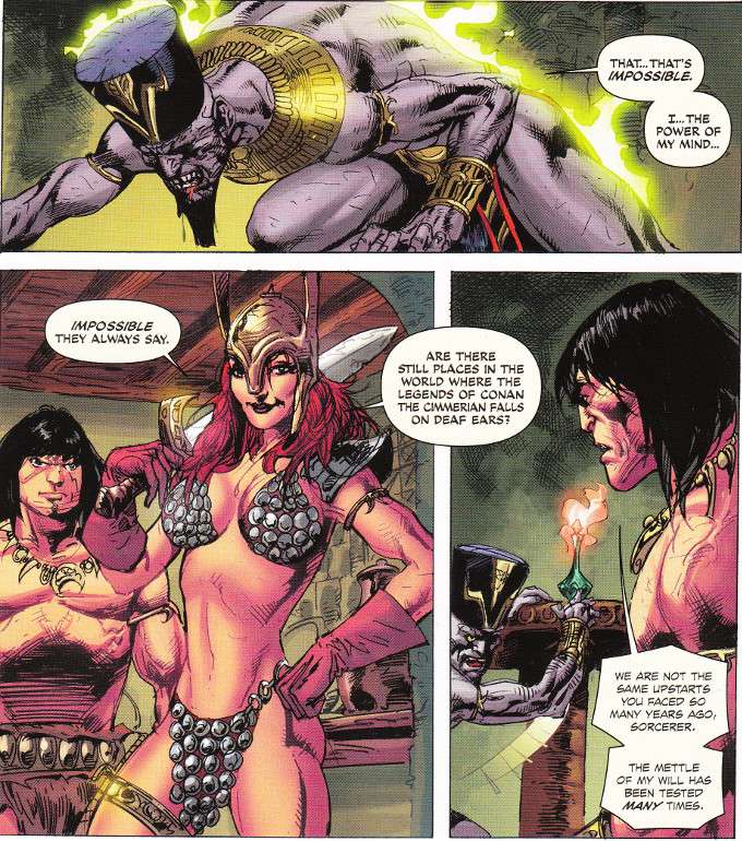
Castro's figures manage to look sketchy while still seeming over-inked. His take on Sonja is as cartoonishly elongated and emaciated as Aeon Flux. And I find it hard to believe that any professional editor would accept artwork where Red Sonja's left arm is growing out of her left breast! Yet here we are...
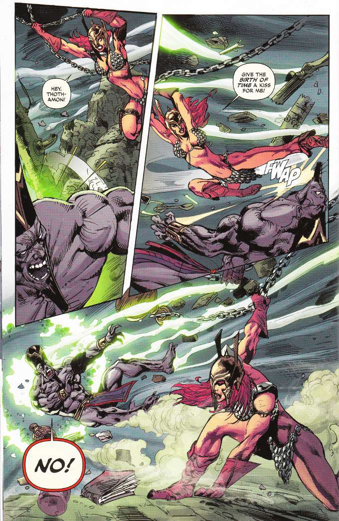
Chuck Norris has a third fist under his beard. Red Sonja has a third sword-arm under her bra.
At this point, I can safely say that Red Sonja/Conan #4 is the worst thing to feature the character of Red Sonja in 2015. And to give you some idea of how damning a statement that is, consider that the final chapter of the utterly horrible Red Sonja: The Black Tower just barely came out in 2015. For all the troubles that mini-series had (and there were many!), at least the artwork was good.
Here, the artwork and story are terrible. This mini-series is a disgrace to both Conan and Red Sonja. If you want a good Conan and Red Sonja team-up book, track down the excellent Conan/Red Sonja series by Gail Simone and Jim Zub. Accept no substitutes!
No comments:
Post a Comment