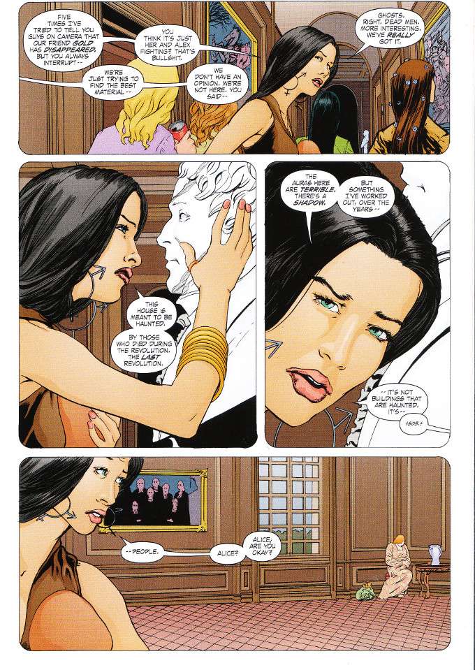
Before they continue the second leg of their world tour, Motherfather have stopped off in France to do a bit of writing and recording. They set up shop in a chateau that has a built-in recording studio and is also reportedly haunted. Of course between the drugs and the documentary camera crew everyone is already feeling like they're being watched. But could there really be something in the chateau's shadows?

Paul Cornell continues to balance the humor and the horror of this story masterfully. There's a good bit of honest drama as well, with a subplot involving the marital difficulties between Kev and his wife Alice meriting special attention. It's moving stuff, yet there's also a few scenes that are likely to inspire readers to laugh out loud.

The artwork is equally marvelous and balanced. Tony Parker's designs for the characters are particularly noteworthy, with no member of the extensive cast looking at all alike. The colors by Lovern Kindzierski are vivid and well-chosen, matching the 1970s aesthetic of the story quite well.


No comments:
Post a Comment