Showing posts with label Ray Fawkes. Show all posts

Thursday, September 11, 2014

Batman: Future's End #1 - A Review

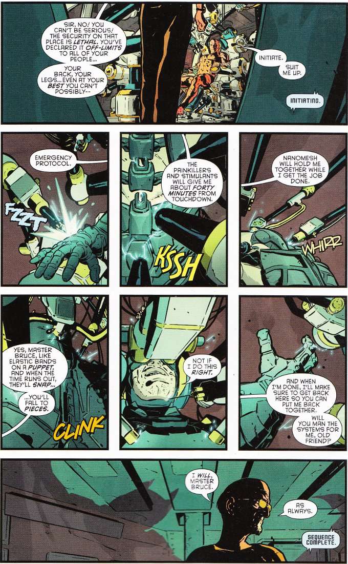
Five Years From Now, Bruce Wayne is a beaten and broken man. His spirit burns as bright as ever but though the spirit is willing, the flesh is weak. And though he has inspired scores of heroes to continue his war on crime, he feels that there must always be a Batman... and that it must be him. So begins a mission... his last mission... to raid the private lab of Lex Luthor and steal what he needs to create a perfect clone - a vessel for his memories that can be Batman eternal.


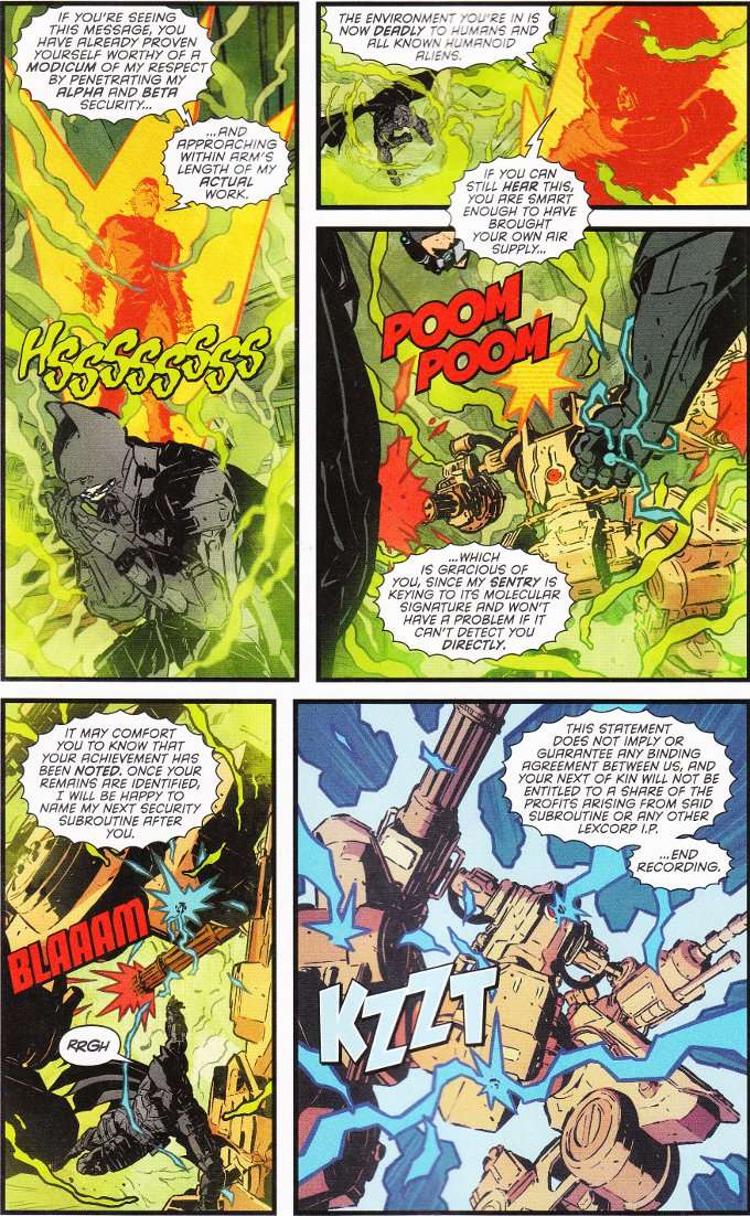
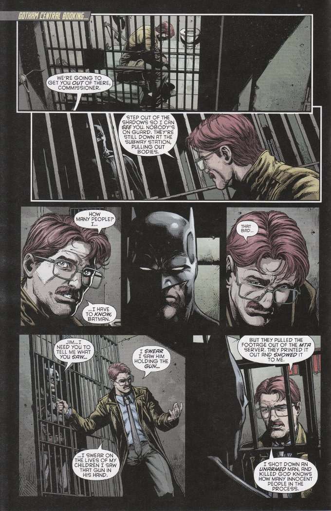
Once one gets past the outrageous premise and how horribly out of character it is for Bruce to deny his base mortality in this fashion, there is an enjoyable story at the heart of Batman: Future's End #1. That story - perhaps not coincidentally - exists independent of the Future's End setting and could have been told in a modern-day Batman story were the McGuffin to be changed. I speak of the scene in which Batman pits himself against Lex Luthor's security and we find that... well, the panel below says it all. Classic Luthor.


Unfortunately, this book is cursed with some of the worst artwork I've seen in a professional comic. Indeed, I had to look up the names of ACO and FCO Plascencia to find out why their artwork and their names seemed familiar. The good news is I figured it out - they were the same art team that drove me off of Constantine with their misshapen figures, poor visual storytelling and horrible coloring.

Enjoyable as it is watching Bruce and Lex match wits, it isn't worth suffering through this artwork.  Nothing is.  Skip this one, Bat-Fans.  There's nothing of value to be found here.

Sunday, June 22, 2014

Batman Eternal #11 - A Review


Let's not mince words or waste time.  Batman: Eternal #11 is one of the worst comics I've seen in recent memory.  Indeed, I'm not sure what aspect of it troubled me most.  The idea of Alfred the Butler being a deadbeat dad who abandoned his wife and daughter?  Barbara Gordon being depicted as a thoughtless thug?  The artwork that seems more appropriate to an issue of Heavy Metal than Batman?  How about all of the above?

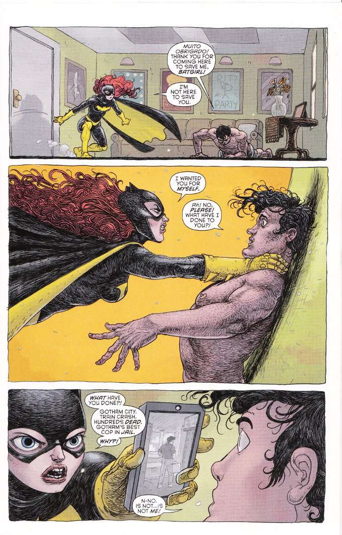
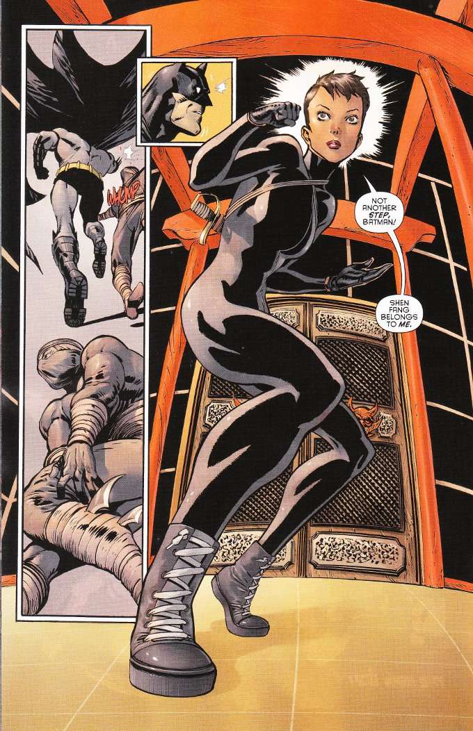
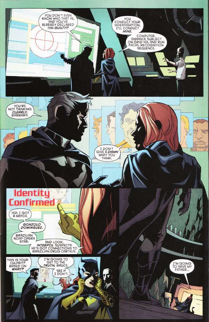
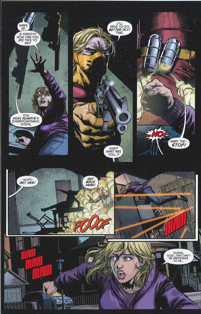
The main focus of the issue is on Batgirl as she storms a South American television studio in broad daylight, seeking an actor who she has determined was involved in framing her father for murder.  Hilarity ensues as the actor is also chased by adoring fans and a supervillain.  The issue also features a subplot involving Alfred trying to make amends with his estranged daughter - an MI6 agent who just happened to wind up in Bruce Wayne's care.  There's also some brief vignettes involving Catwoman that probably mean something if you've been reading her book (it isn't explained well) and Stephanie Brown researching her father's criminal past.

To say that Batgirl is horribly out of character in this book compared to how she is depicted in her own title would be an understatement!  How is it possible that I picked up three comics this week and the one featuring a murderous berserking redhead didn't have "Red Sonja" in the title?  Barbara Gordon is a thinker.  A planner.  She does not lose control and she does not lose her temper.  Her major defining flaw in recent years has been being too cool and clinical - not being a cliche fiery redhead or Irish spitfire.  And she certainly doesn't need the likes of Jason FRELLING Todd giving her lectures on self-control!

The artwork by Ian Bertram isn't all that bad but it is ill-suited to the story in question.  It has a quality that is reminiscent of Frank Quitely, though Bertram draws bigger eyes than he does.  It also makes me think a little bit of the exaggerated yet detail-driven style of Simon Bisley, though Bertram's style is much cleaner and brighter.  In any case, this look just doesn't fit the aesthetic of Batman very well and the whole book looks odd as a result.

Monday, June 16, 2014

Batman Eternal #10 - A Review

Batman Eternal #10 was of such dramatically dismal quality compared to the earlier installments I'm contemplating dropping the title.  Part of this is due to the artwork of Riccardo Burchielli, whose work on Conan The Barbarian I found utterly appalling and his work here is not much better.  I will say that Burchielli does do a good job depicting the misshapen and horrific creatures that make up Professor Pyg's gang.  Unfortunately, the normal human characters look equally misshapen and horrific.

Colorist Dave McCaig doesn't help matters with a muted palette that sucks the life out of the action.  Worse yet, the palette is unevenly applied, with skin tones changing from panel to panel with no indication of any change in light or position!  At some points Catwoman looks like her animated incarnation from the later episodes of Batman: The Animated Series, where she had blueish-white skin whenever she was in costume.  Again, this might be acceptable as an artistic choice were it evenly applied... but it isn't!


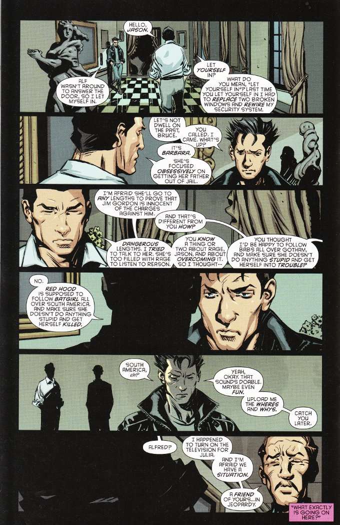
The script by John Layman is equally problematic.  I already raised objections to the idea that Barbara Gordon should be portrayed as a violent hothead, even allowing for her feelings regarding her father's imprisonment coloring her judgement.  I have even greater objections to this issue, in which Bruce Wayne asks Jason Todd to keep an eye on Batgirl and make sure she doesn't do something stupid and get killed.

I am going to say that again, because I think it's rather important.  And if you can imagine this next line being read by comedian Lewis Black, so much the better.

Bruce Wayne asks Jason Todd - his ex-sidekick who has anger-management problems up the wazoo and no qualms about killing - to keep an eye on Barbara Gordon - widely regarded as the most cool and logical of Bruce's protegees - and make sure she doesn't do something stupid and get killed.

... ARE YOU F#$%ING KIDDING ME?!?!


I'll give it one more issue.  That's it.

Wednesday, June 11, 2014

Batman Eternal #9 - A Review

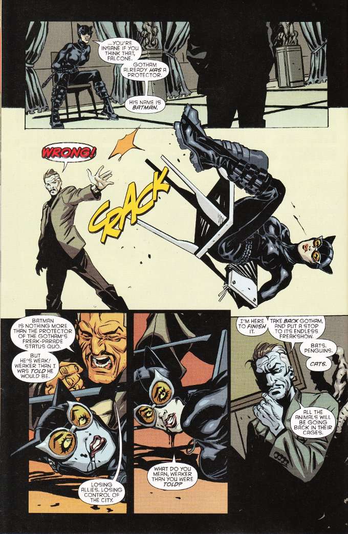
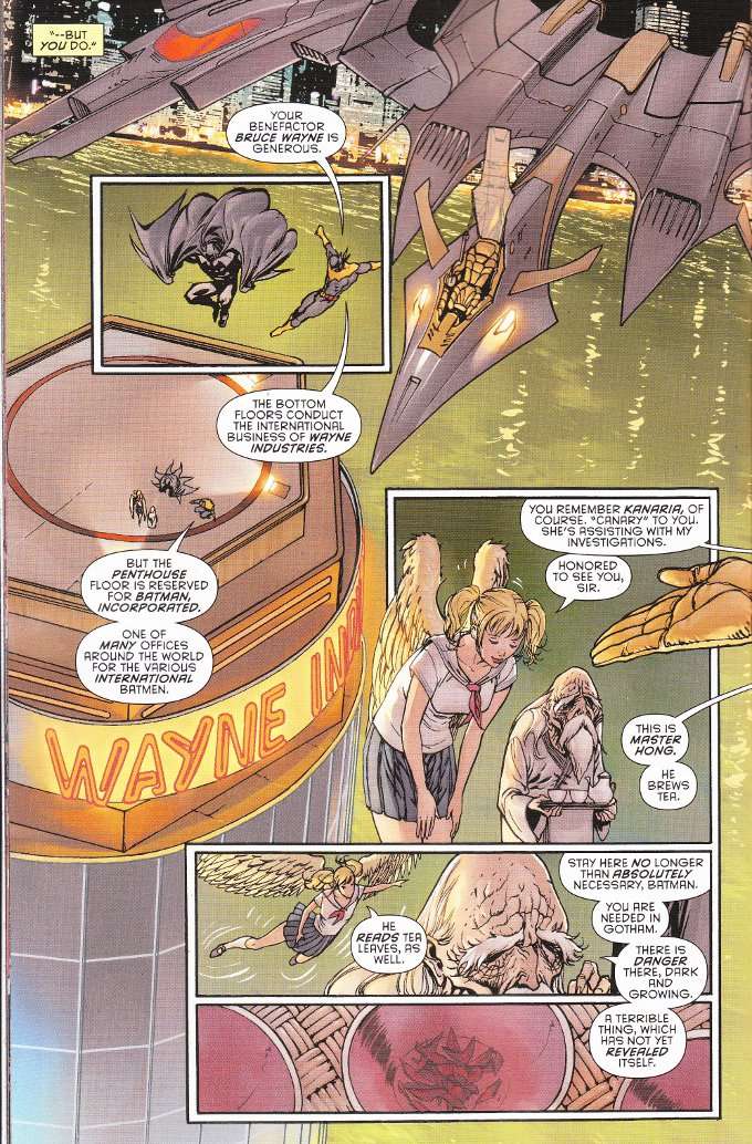
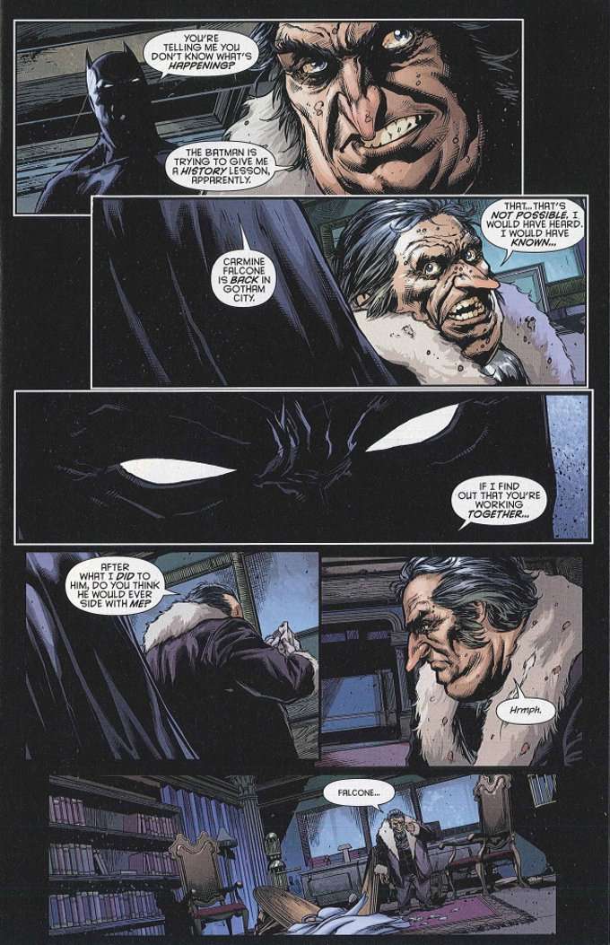
Batman Eternal #9 finds The Caped Crusader leaving Gotham City for a time.  With the GCPD out for his head, Batman decides to head to Hong Kong and track down the crime bosses who assisted Carmine Falcone during his five years in exile.  He is assisted in this endeavor by Batman Incorporate's agent in Japan.  At the same time back in Gotham, Catwoman begins planning her own strike against Falcone.


After reading this issue, I want to see more comics with the Japanese Batman.  It's just such a cool concept to have a Batman flying around Tokyo and that his sidekick should be a flying schoolgirl called Canary.  I know, I know... just get Dinah in there for an issue to give her some martial arts training and we'll have something awesome.


I slammed Guillem March's artwork pretty hard in my review of Catwoman #1 but there's nothing at all bad about it here.  Perhaps the previous focus on Selina Kyle's anatomy was due to the script and not the wandering eye of the artist?  Regardless, there is no odd male-gaze in the artwork in this issue despite the main female characters being clad in skin tight leather or school girl uniforms and the fight choreography is well played out.  Even the colors of Tomeu Morey don't seem so grating in this issue, where the oddly bright coloration actually fits the setting.

Monday, June 2, 2014

Batman Eternal #8 - A Review

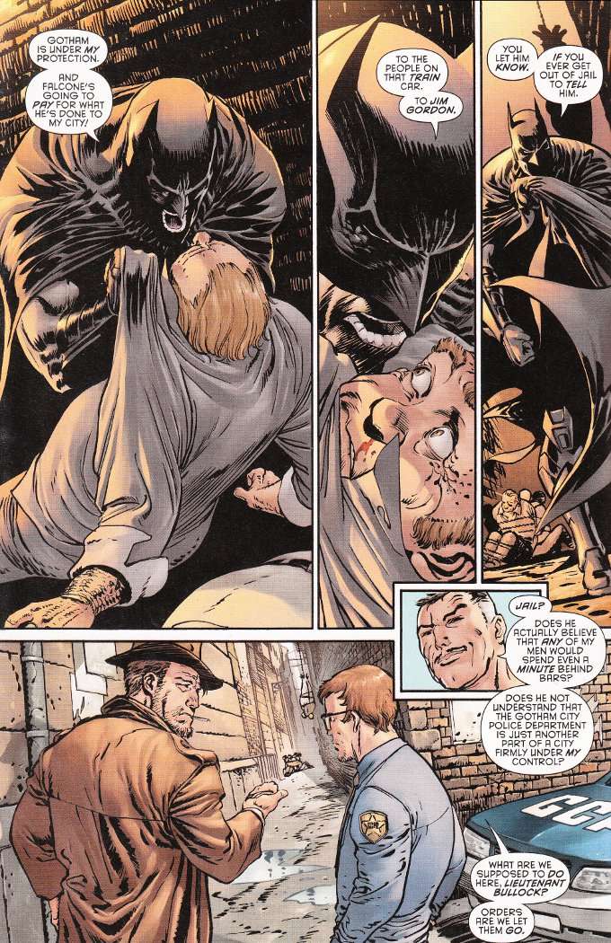
Batman's war with mobster Carmine "The Roman" Falcone continues to take center stage in this week's issue of Batman: Eternal.  It is a war that Batman doesn't realize he is losing, as unbeknownst to him - but knownst to us - the new Police Commissioner is in Falcone's pocket.  Worse, he's instituted a new policy of refusing to arrest any criminals Batman brings down.


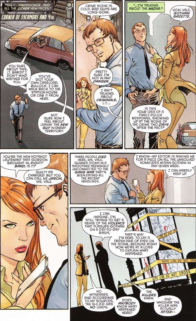
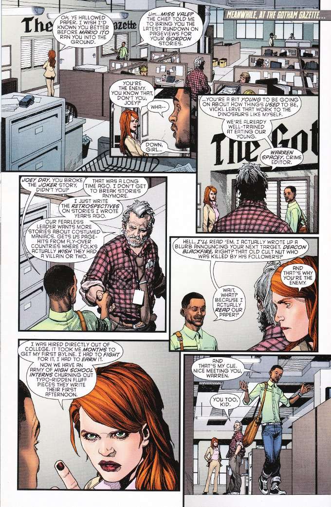
The script by John Layman does a good job of balancing multiple subplots that mix and mingle throughout the issue.  Vicki Vale - still pursuing her story from several issues early - runs into honest cop turned flummoxed rookie Jason Bard and the two interact for a bit before getting on with their respective bits of business.  But it isn't all interaction and the issue concludes with the series' most thrilling action sequence to date.


The artwork by Guillem March seems reminiscent of the early works of Todd MacFarlane in terms of design and detail.  Some sections seem a little rushed but the pencil-work is largely excellent.  The only real flaw to the artwork is the washed out palette, full of dirty browns and greys, used by colorist Tomeu Morey.  Even the blue of Jason Bard's uniform looks more grey than blue.    

Tuesday, May 27, 2014

Batman Eternal #7 - A Review

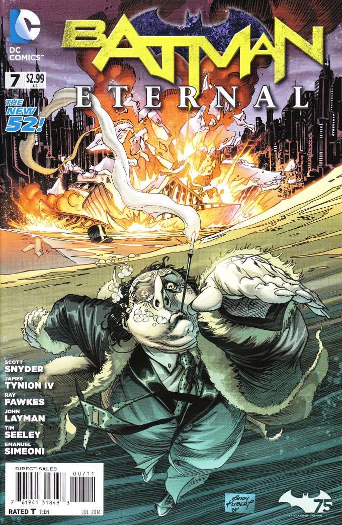
Sadly, the scene on the cover of Batman Eternal #7 doesn't actually occur in the book.  A shame, as the image of The Penguin using his cigarette holder as a snorkel as he swims for his life is an amusing one.  It is also an apt metaphor for the action of this book, which does see The Iceberg Lounge destroyed and good old Ozzie forced to "sink or swim".


The interior art isn't quite so nice.  Emanuel Simeoni is a good artist and one can see fragments of fine detail throughout the book.  Sadly, most of this detail is lost under heavy inking that obscures the artwork rather than enhancing it.


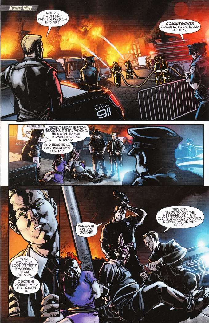
Thankfully the writing is as strong as ever.  This issue shifts focus back to the main story involving Batman coping with the return of crime-boss Carmine Falcone and his new-found allies in the GCPD and the Mayor's Office.  I shan't say more but those who were worried that this series would spend too much time on the side-stories after the past two weeks should rest assured this book has not forgotten its purpose.

Tuesday, May 20, 2014

Batman Eternal #6 = A Review

As was the case with last week's issue, Batman Eternal #6 seems less interested in its grand central mystery than it is in expanding the world of New 52 Gotham.  Most of this issue is devoted towards introducing us to two of Batman's more obscure partners - Batwing and The Spectre.  The two are quickly teamed together to deal with a supernatural menace that Batman has little time and even less inclination to deal with personally.


The script by Constantine writer Ray Fawkes contains much of interest.  The revelations that Batman has enough Nth Metal to make a batarang and that it can be used to disrupt ectoplasmic figures is but one of the more fascinating bits of trivia this issue has to offer.  I also liked the idea that the normally unflappable Alfred is made uncomfortable by Master Bruce's mystic associates or that weird things happen to mirrors around The Spectre.


The artwork by Gates of Gotham artist Trevor McCarthy is a suitable fit to the script.  McCarthy's figures are oddly blocky and seem better suited towards a Vertigo series than the world of Batman.  Nevertheless, this distinctive style is gripping and properly spooky when it needs to be.  

Tuesday, May 13, 2014

Batman Eternal #5 - My Review

The best parts of Batman Eternal thus far have little to do with its central mystery.  This is not to say that the mystery isn't engaging but to note that the detail work around the plot is of greater interest.  The world of Gotham in the New 52 universe is still largely unexplored and this series has done a good job of filling in the gaps.


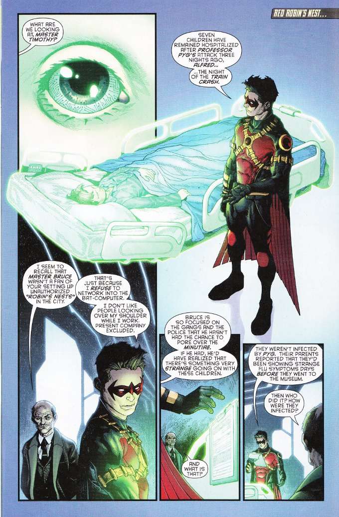
This issue focuses upon three characters we have not seen in this series so far - Red Robin, Vicki Vale and Harper Row.  The issue shows those of us who haven't been keeping up on Teen Titans how the relationship between Tim Drake and Bruce Wayne is quite different in this new reality.  The interludes involving Vicki Vale give us our first glimpse as to how journalism functions in Gotham City.  And Harper Row makes an appearance, showing that she has been personally touched by the mystery that Red Robin and Vicki Vale are both investigating and that she has begun training to take a more active role in helping Batman.


The artwork this week - provided by artist Andy Clarke - proves less conflicted than the art in last week's issue.  Clarke's style is consistent, though some of his proportions seem a bit off.  Torsos become oddly elongated in some panels, while the limbs attached to them seem to be of normal size.  Despite this incongruity, Clarke does a fine job of displaying intricate details without cluttering up the panels.

Sunday, May 4, 2014

Batman Eternal #4 - A Review

Batman Eternal #4 proves to be the first misstep in this series' run.  That misstep is not due to the art team., despite Dustin Nguyen and Derek Fridoles having a far different style from Jason Fabok who drew and inked the first three issues.  Nguyen's light, almost Mangaesque pencils offer a unique, angular look and Fridole's inks - with some exceptions - are kept light and restrained, allowing the original pencils to shine through.


No, the biggest problem with this issue is the script.  Specifically, the dialogue.  John Layman's take on Batgirl and Batman don't ring true to me.  Even with her father in danger, I can't see Barbara Gordon acting as rashly as depicted here.  Nor can I see Bruce Wayne being so quick to dismiss Barbara's desire to investigate a suspicious figure she spots on the security camera footage of the crime scene, because they have no reason to suspect said figure save that he spent three hours hanging around the crime scene before anything happened!  Particularly when Bruce freely admits to having no better leads himself.


Despite this forced dialogue, the story is still a strong one.  The plot involving the corruption of the GCPD continues apace.  There's also an interesting twist in the subplot involving Stephanie Brown that marks a major departure from the original comics in which she appeared.  This comic is still an enjoyable read, if you just get past some of the words that the characters are saying.

Wednesday, April 30, 2014

Batman Eternal #3 - A Review

At this moment in time, there seems little point in my maintaining any aura of mystery in discussing Batman Eternal.  The story is moving at a quickening pace and many things I thought would be a drawn-out mysteries have been quickly exposed and revealed.  Suffice it to say, this comic is one for the ages and will be held up as one of the greatest Batman stories of all time.

So what can I say?  How about that this comic formally introduces Stephanie Brown into the New 52 universe?  Or that, while she's not yet The Spoiler - much less Batgirl - she quickly proves that she is no passive damsel in distress while still coming off convincingly as a terrified teenage girl, who just learned that her father is a supervillain involved in a plot to bring down the society of Gotham City.  


What can I say about the splendor that is Jason Fabok's artwork?  I can say that I think his design for The Penguin is the greatest I've ever seen - a character who is grotesque yet not so distorted as to seem a more fitting enemy for Dick Tracy than Batman.  I could easily see Alfred Molina playing this Penguin.


What else can I say?  This is a great book and you should be reading it.

Tuesday, April 22, 2014

Batman Eternal #2 - A Review

I've complained in previous reviews of the main Batman series that Scott Snyder seemed to be have been taking his sweet time in telling his stories since City of Owls.  Zero Year in particular seemed to have been drawn out, with the promise of a revamped and deadlier Riddler being held ever out of reach until recently.  Well, I can make no such complaints about Batman: Eternal.  


The first issue kicked things off with a bang and this issue continues the trend, as Batman mobilizes his allies in the wake of a major disaster in Gotham City.  A disaster which Jim Gordon seems to have caused but nobody in the Bat Family or the GCPD can honestly believe he is responsible for.  There's a lot of good character moments throughout the book and we know what villain is responsible for Gordon's fall by the issue's end.  I won't spoil it here but it was an honest surprise and a true indication of how things have changed for Gotham City in the New 52 universe.


The artwork is uniformly excellent.  Jason Fabok's matches Bryan Hitch for the ability to fit amazing amounts of detail into a panel but I think Fabok's line-work is neater and more precise.  The inks are surprisingly sparse for a Batman comic and colorist Brad Anderson highlights the artwork with multiple shades of black and grey.

Tuesday, April 15, 2014

Batman Eternal #1 - A Review

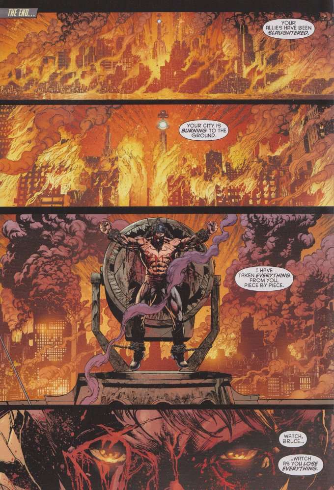
I will say this for the writing team of Batman Eternal - they do not do things by halves.  There was a hint of this in the preview for this series, which depicted Harper Row (a supporting character from Scott Snyder's Batman) as a masked crime-fighter working alongside Batman, Selina Kyle as the new kingpin of the Gotham underworld and - in a shocking twist that saw fans across the Internet cheering - Stephanie Brown as The Spoiler.  And then we have this first issue, which opens with Gotham City in flames and Bruce Wayne all but crucified on the broken remains of the Bat-Signal.


Okay, book.  You have my attention.

We move past this scene set in a vague future, heading back to "Now".  It is here that we are introduced to Jason Bard - a good cop hired into Gotham by Commissioner Jim Gordon, who is unable to meet Bard for his first day at work as he is busily chasing down the mad scientist Professor Pyg alongside the Batman.  The action sequences there are thrilling but the true focus of the story is upon Bard, who is quickly introduced to just how bad Gotham City is and why Jim Gordon was so anxious to get an honest man like Bard into a command position in the GCPD.  By issue's end, we see a major change to the status quo of things in Gotham City and our first sign that someone is out to bring down Batman, one ally at a time.


Jason Fabok's artwork is as enthralling as the script.  I greatly enjoyed his work on Batman Annual #1 and the pencils and inks here are of similar high quality.  The figures are all clear and uniquely designed, with even the scenes of characters just talking to one another being well-blocked and far from static scenes of talking heads.

This book is a promising first issue.  I'm not sure yet if I'll stick around for the whole year-long saga, but it has my attention.  For now.

Tuesday, November 19, 2013

Constantine #8 - A Review

This issue is notable for several reasons.  It marks the end of the Constantine series' first story arc.  It marks the point where it finally catches up with the Forever Evil storyline it is meant to be tying into.  And it's also the last issue of this book I intend to buy for the foreseeable future, though the reasons for that have nothing to do with the endless tie-ins to crossovers I care nothing about.  


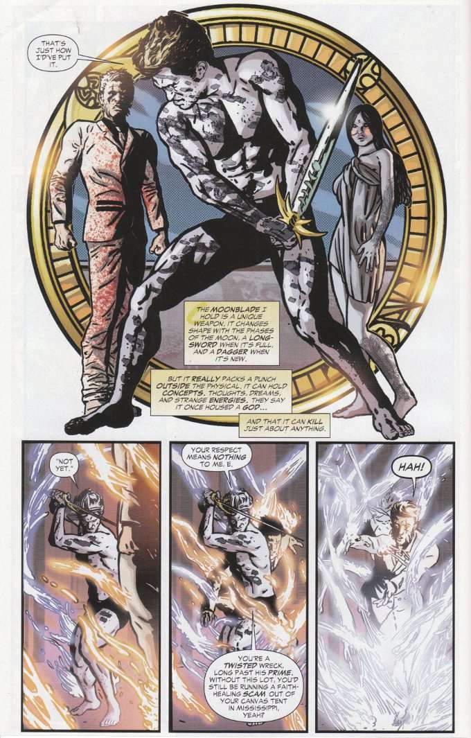
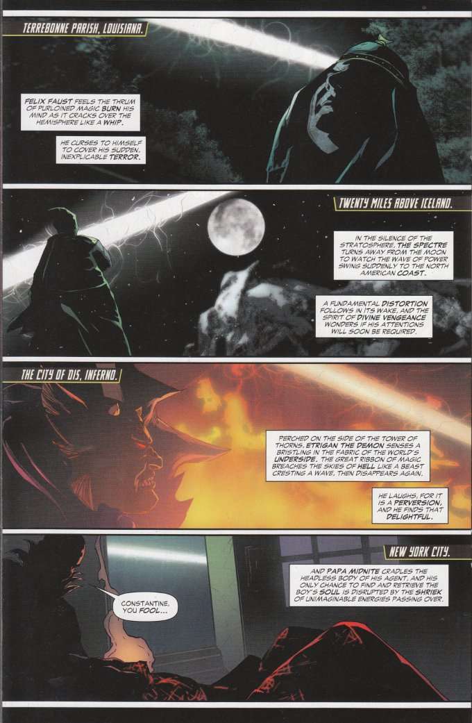
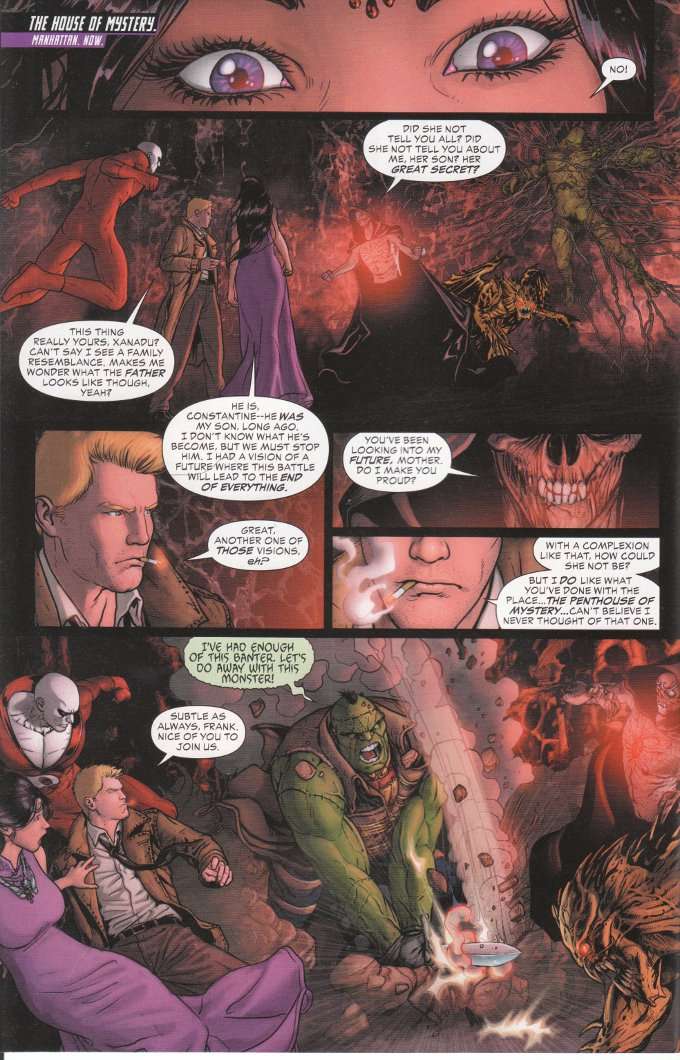
So why am I dropping it then?  Because I have certain expectations for what should and should not happen in a John Constantine story and Ray Fawkes has failed to meet them.  The moment John Constantine is cutting down his enemies with a soul-sucking sword is the moment he ceases to be John Constantine and starts being Elric.  And if I wanted to read Elric, I would do so.  


The artwork by Aco and Brad Anderson is another factor.  Simply put, this is some of the worst artwork I've ever seen in a book published by a professional company.  Aco's linework manages to be over-detailed yet indistinct.  The inking and the coloring are completely at odds with one another, creating panels that somehow manage to be drowned in shadows while still resembling a bright, over-saturated photograph.

This issue is an unsatisfying conclusion to a series that showed promise but ultimately proved disappointing in ways beyond what we Hellblazer fans feared.  John Constantine may still smoke, drink and cheat the devil but that's all he has in common with the man he once was.  This new Constantine is an honest power to be reckoned with rather than a jiujitsu master who knew how to use what little power he had t to turn other people's strength against themselves... and an honest power is the last thing John Constantine should ever be.

Monday, October 14, 2013

Constantine #7 - A Review

The biggest problem with Constantine #7 is a lack of the title character.  John is present during the events of the issue but he is largely a bystander to the action despite seemingly being the focus of attention.  The plot sees three of John's enemies working together to destroy John's power and his allies while trapping the man himself.  John is uncharacteristically passive while all this is going on and we see more of other magic-users and magical beings reacting to the closing net than we do of John working against it. 


New artist Szymon Kudranski proves a largely unwelcome change from


I don't think I'll be keeping up with Constantine in the future.  The book is decent but I expect more of ol' ConJob.  Additionally, the recent previews suggest a greater emphasis on tie-ins and crossovers in the coming months and while I do enjoy seeing John pitting his wits against the DC Universe at large again, I'd much rather his solo series focus upon John's adventures apart from Justice League Dark. 

Sunday, September 15, 2013

Riddler #1 (Batman #23.2) - A Review

The Riddler has always been my favorite Bat-villain and one of my favorite comic characters period.  I have a special fondness for all the characters who feel a need to prove themselves in some form or fashion.  And if my inner supervillain might make a confession, I'll admit to having a certain sympathy for Edward Nygma as another intellectual who doesn't suffer fools well, though I'm not homicidal about it. 

Both of these ideas are at the center of Riddler #1 - a special that focuses upon the method behind the madness of Edward Nygma as he attempts to circumvent the security of Wayne Enterprises' corporate office.  Why?  For several reasons that are revealed as the story unfolds, but in part just to prove that he can.
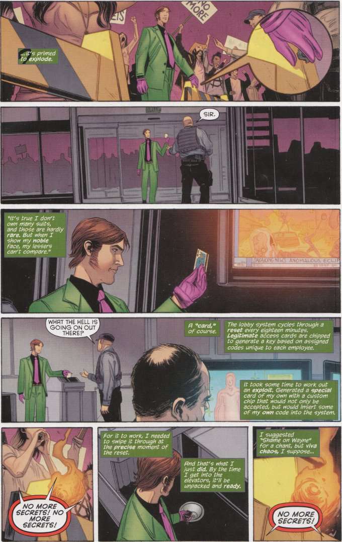

Nominally this issue is a tie in to the Batman: Zero Year event currently taking place in the main Batman book.  However, the only obvious connection to that story is that this features Scott Snyder's take on The Riddler.  This Riddler is a fixer - a trouble-shooter who sees to the dodgy work of other people for a price.  At least, that was Edward Nygma's role until seemingly being spurred to self-interest after one of his employers asked him what was the point in being the smartest man in the room if nobody else knew it?

Snyder's Nygma is different than previous incarnations of the character, being as much a master of multiple disciplines as Bruce Wayne.  Comparisons might be drawn between this Edward Nygma and Jim Moriarty from BBC's Sherlock, where Holmes' greatest enemy has been reimagined as a consulting criminal who helps other evil-doers as consulting detective Holmes assists the police.  Nygma is as mentally unstable as ever, though his psychosis takes the form of an obsessive-compulsive disorder that drives him to be a literal know-it-all.  It's an engaging take on the classic formula and Ray Fawkes does a good job bringing it about.   
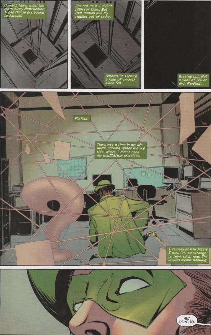

Jeremy Haun offers an equally inspired visual redesign of The Riddler.  With his new sideburns and tools that basically amount to a piece of psychic paper and a multi-tool cane, it's hard not to see this Nygma as looking somewhat like David Tenant - perhaps drawing inspiration from a now famous fan poster?  Regardless of the inspiration, Haun's cinematographic style depicts the story perfectly.  The direction is fittingly reminiscent of several recent heist movies and the action is well-paced throughout.

Riddler #1 is a welcome relief from the banality of titles that have made up the majority of the Villain's Month books so far.  There are no tired tales of abusive childhoods here - merely Edward Nygma being his brilliantly baffling self.  It's a good read for Riddler fans both old and new and gleefully fun in a sadistic sort of way.

Sunday, August 18, 2013

Constantine #6 - A Review

The cover of Constantine #6 is a load of bollocks.  While the plot does find John Constantine trapped outside of his body with only a thin silver cord connecting him to the world of the living, he does not face the spirits of every friend he's ever sacrificed.  Merely the surly spirit of Chris, the psychic whom died back in Constantine #1.


Despite this, Ray Fawkes does deliver another exciting script and there's nothing at all wrong with this story save that it doesn't match up to the cover.  The drama builds beautifully as John's many enemies begin closing in to finish him off.  There's also a set-up for two new mysteries for John and the readers to explore in the coming issues.


The art of Renato Guedes seems to be getting better with every issue.  John Constantine hasn't had an artist who could depict the inhuman horrors of the world of magic with such detail and clarity in quite some time.  Of particular note is a two-page splash sequence in the center of this story that, for once, justifies taking up so much space. 

Wednesday, July 31, 2013

Constantine #5 - A Review

You really have to hand it to Ray Fawkes.  At a time when most monthly comics are "written for the trade", he still takes the effort to make every issue of the books he writes accessible to new readers on the off-chance it might be someone's first.  This is especially notable - and important - with a comic like Constantine #5, where the odds are particularly high that the issue will be picked up by readers who only bought it because it's a tie-in to the Trinity War storyline.


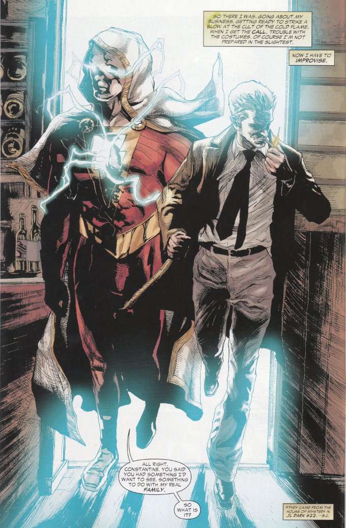
Those hypothetical new readers are in for a treat, for Fawkes is a skillful writer as well as a generous one.  The story is vintage John Constantine, as everyone's favorite magical conman steals the power of Shazam on the grounds that a teenager like Billy Batson running around with that much unchecked magic is dangerous with everything else going on in the world at the moment.  By sheer dumb luck, one of John's many enemies chooses this moment to attack him with a demonically-empowered minion and hilarity ensues.


Artist Renato Guedes has shown his skill in depicting the gore and horror of a typical Constantine story in earlier issues.  This book gives him the chance to show he's no slouch when it comes to drawing the usual superhero shenanigans.  Despite this, Guedes' typical shadowy mystique remains unchanged and the aura of mystery that usually shrouds this book remains even as John is forced into a pair of tights and reduced to punching monsters. 

Tuesday, July 2, 2013

Justice League Dark #21 - A Review

Despite having greatly enjoyed Jeff Lemire's recent work on Green Arrow and Constantine, I haven't read any Justice League Dark since he and Ray Fawkes took over the title.  I only picked up this month's issue after being informed by my Friendly Local Comic Book Guy that it tied into the upcoming Trinity War.  It doesn't.  At least not in any way that is immediately obvious.


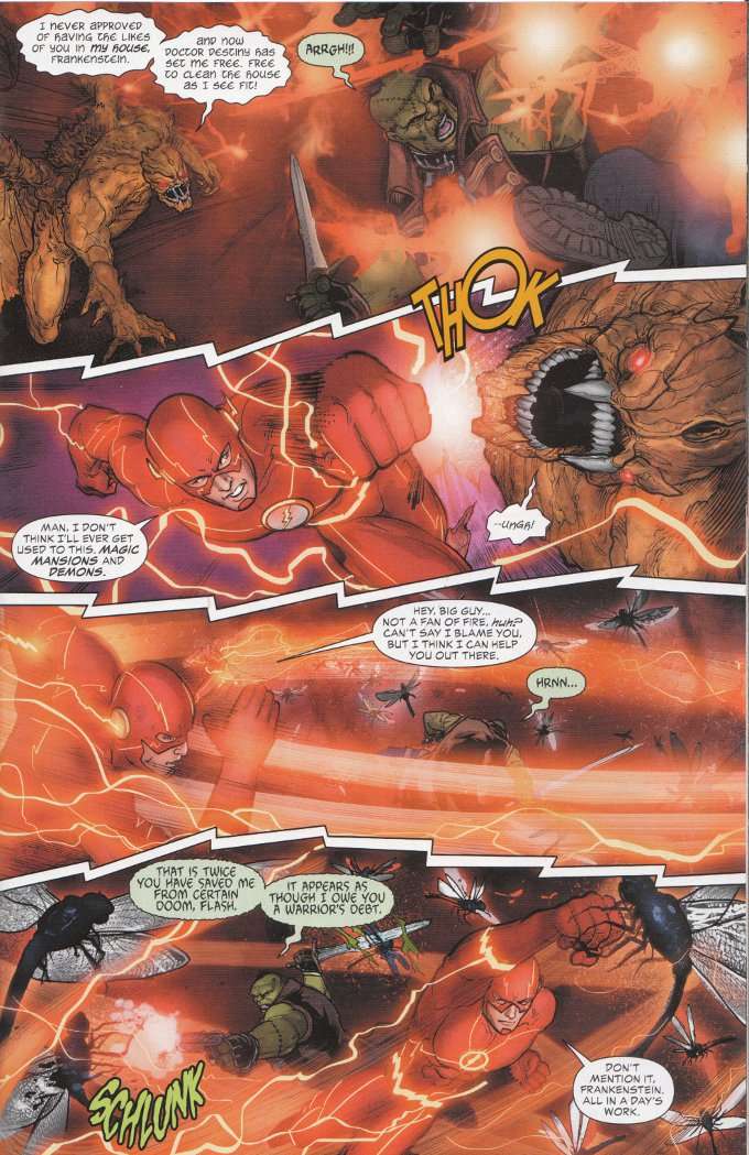
Thankfully Fawkes and Lemire make this issue surprisingly accessible despite it apparently being the final issue of a longer storyline.  I still wouldn't recommend it to new readers as I probably would have had a harder time following the action of this issue if I weren't already familiar with the characters involved.  Still, the script here is well-written and engaging.  Heck, I even overcame my general antipathy for Barry Allen in this issue, finding it fun to watch the science-minded speedster having to run around a mystical threat.   


One thing about this book that hasn't changed since the last time I glanced through it is the artwork, which continues to be some of the best in the business.  Mikel Janin is a phenomenal artist who fits an amazing amount of detail into each panel without making things cluttered or dirty.  Reportedly inker Vicente Cifuentes handled the finishes on the final half of the book but I didn't see any difference between the two halves.  Either Cifuentes is an incredibly skilled inker who was able to match Janin's stule perfectly or someone in the credits department of DC Comics is a liar.  I lean toward the former explanation, given Cifuentes' similar stellar work on matching Ed Benes' inking style on Batgirl.

On the whole, I was impressed with this issue and am starting to wonder if I made a mistake in not covering it sooner.  I'll definitely be following it through The Trinity War.  Perhaps even after that. 

Sunday, June 16, 2013

Constantine #4 - A Review

Shagged out and burned out from his recent trials and tribulations in London, John Constantine decides to take a day off from the business of balancing the cosmic scales.  Alas, things are rarely that simple for John and what is meant to be a day of smoking, drinking, seeking out old friends and slouching around is quickly complicated by shadowy stalkers and portents of conflict.  And then there's the matter of the crime-boss/voodoo priest who is out for John's blood and/or soul...


The script for Constantine #4 does a grand job giving us a day-in-the-life story while still expanding upon John's world without seeming overly expository.  Obviously there's some set-up for the upcoming Trinity War storyline but the plotting fits naturally into the narrative.  Zatanna's rather complicated relationship with John is also explained for those of us who are coming into this title without having seen the two working together in Justice League Dark.


The artwork by Fabiano Neves is competent enough though one aspect of it does disturb me somewhat - John's lack of expression.  With a few exceptions (chiefly when he's having the crap kicked out of him) John has the same stoic neutral expression throughout the book.  While I can understand him trying to keep a poker-face up while starring down Papa Midnite or putting the fear of god into a rube, I would expect him to smile somewhat when dealing with Zatanna as he tries to pour on the charm or when he's over-tipping his tobacconist.

Apart from that, the story is well-depicted and the flow of action from panel to panel is good - John just looks far too dour in most of the pages of this book.  It isn't enough to make me not recommend the title - this is a damn good series!  But there's a reason John is called The Laughing Magician and the art should reflect that. 

Tuesday, May 28, 2013

Constantine #3 - A Review

 There is much to admire about the new Constantine title.  The writing by Jeff Lemire and Ray Fawkes is stellar, of course.  The artwork by Renato Guedes is among the finest you'll find on the shelf today.  But it's the little things about this book that I like the most.  Small touches like how the first page of every issue so far recaps the action of the story thus far while still giving us some of the ol' Constantine snark.

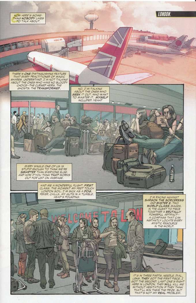
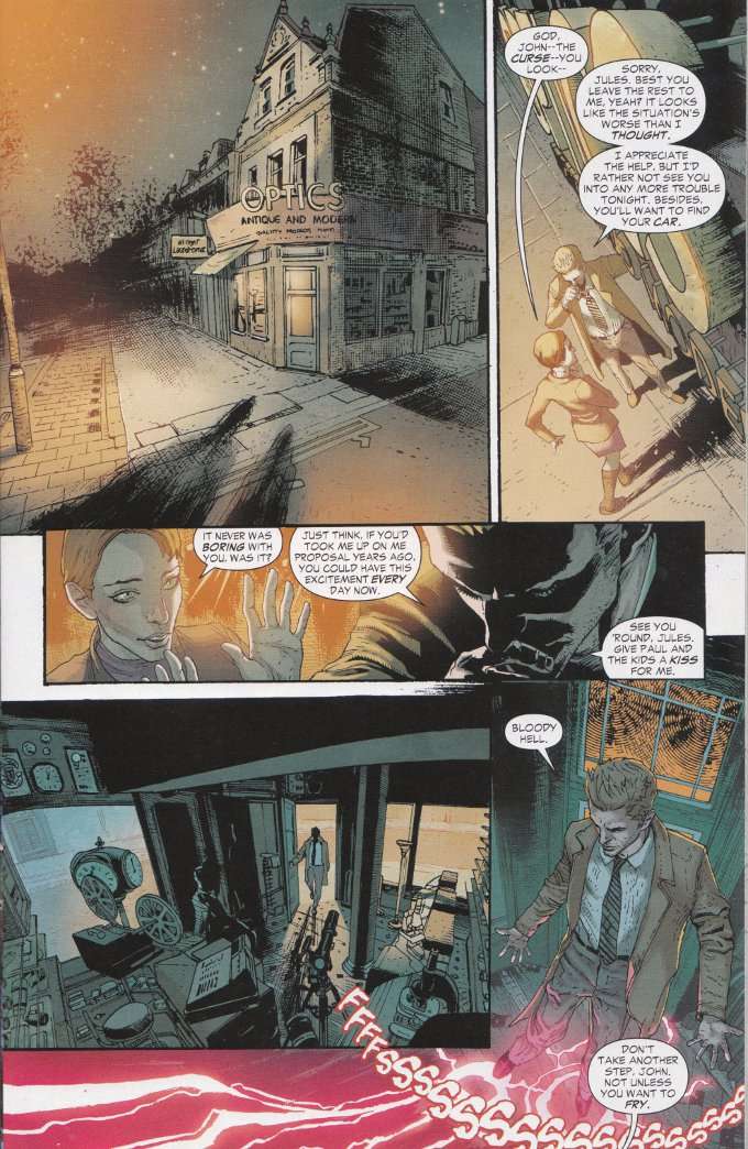
A nice touch specific to this issue is the writers subtly addressing one of the more frequent complaints about John Constantine in The New 52 and doing so in a way that makes perfect sense while opening up avenues for future stories down the road.  In this case, we finally learn why John has been globe-trotting so much and not spending any time in London.  It seems a curse lain by some unspecified baddie in the past has left John with a severe allergy to his adopted hometown.  Even if John can find a way to temporarily shield himself from the city literally sucking the life out of him (as he does in this issue) he still has to contend with synchronicity finding a way to kill him through a traffic accident or some other random disaster.  


If you're a fan of Hellblazer who has resisted the enchantment of Constantine thus far, I urge you to give this book a shot.  Let it work its' magic on you.  I'll think you'll find it as enchanting as I do.  No bollocks.