Showing posts with label Marc Deering. Show all posts

Wednesday, October 12, 2016

Howard The Duck #11 - A Review

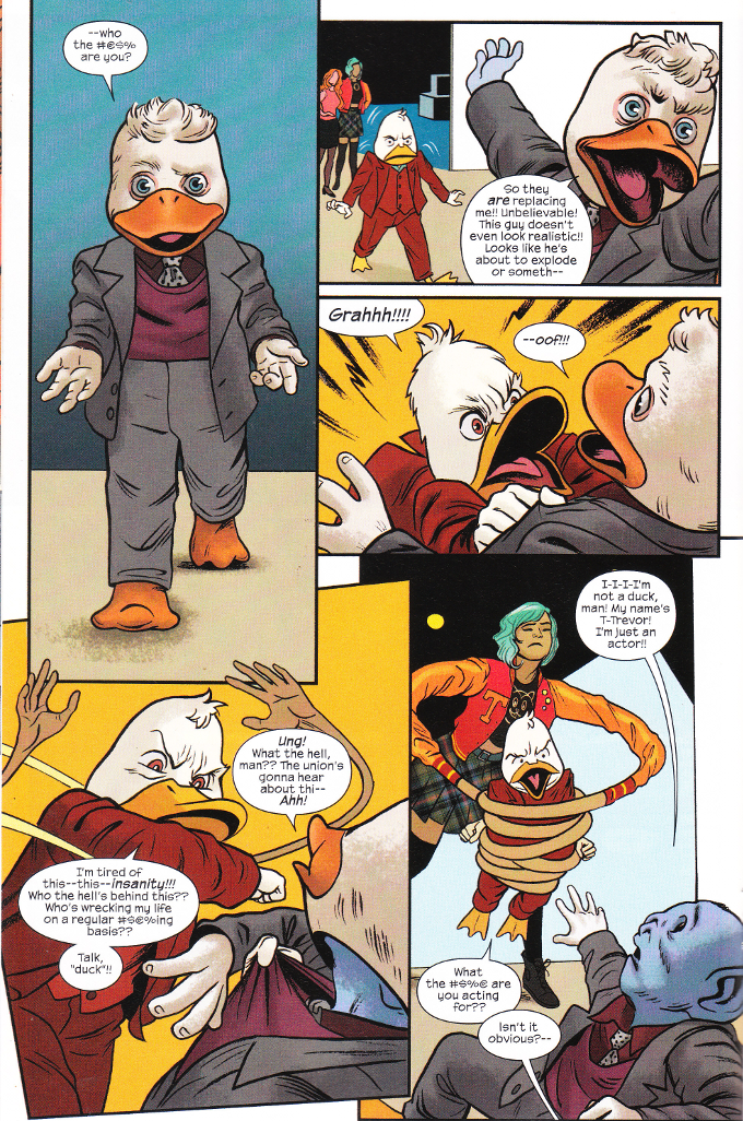
Howard The Duck is dead but the chaos he attracted lives on. Now, as a group of intergalactic content-creators who manipulate the heroes of the universe for their own ends attempt to take control of the situation, Howard moves on to his final rest.

Oh, if only it were that simple...


There is little I can say about this series at this point beyond this: Chip Zdarsky and Joe Quinones have done the legacy of Steve Gerber and Val Mayerik proud.

This Howard the Duck run - too good for one volume - did not try to ape the style of the classic series but it did what the original series did in the 1970's - examine the comic industry and the world at large through the lens of The Marvel Universe and everything that makes them all so gloriously insane. This was no small thing in a year in which Howard The Duck running for President might be seen as the best of all possible options even to those who only know him for "that crappy George Lucas movie" and Marvel Comics became hopelessly devoted to promoting special event after special event.

Yet this book remained free and true to its vision to the very end. More, it proved what wonders can be created when writers and artists are free to create and not beholden to the whims of an editorial team devoted to crafting the next big spectacle, so that they may build audience interest for the next big spectacle to follow.  It is a lesson that will surely be lost upon The House of Ideas but, for a time, at least, the sanity of the everyduck prevailed.

Monday, September 5, 2016

Howard The Duck #10 - A Review

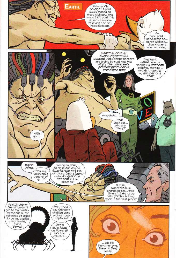
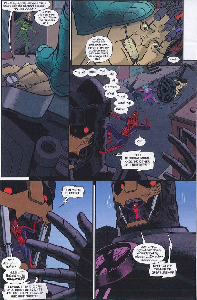
Howard The Duck just learned that his life is The Mojoverse's most popular reality show!  The problem is that this discovery was orchestrated by two alien "content creators"- Chipp and Joe - whom Mojo was paying to introduce random craziness into Howard's life to make things more interesting. Now, Howard is - as usual - caught in the middle of it as everyone is trying to cover up their various misdeeds with as much ratings-rising violence as possible.


With this gloriously metatextual issue, Chip Zdarsky has proven himself the premiere satirist of modern Marvel Comics and  a worthy heir to Steve Gerber's throne. The artwork is equally strong across the board. Still, all good things must come to an end and as much as I want to see how they end it all, I am not looking forward to the series finale.

Thursday, July 28, 2016

Howard The Duck #9 - A Review

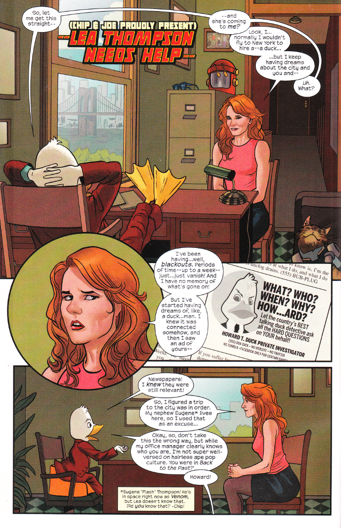
No sooner has Howard returned home and he's hit with another case. And a case from a big Hollywood actress! Well, so she says. Howard doesn't keep up on hairless ape culture. But his interest is piqued when this Lea Thompson says she's been having dreams of Howard. Dreams that seem oddly close to the events of Howard's life...

The artwork for this issue is more erratic than usual. It isn't bad but there's little sense of visual continuity from page to page. Occasionally, it isn't consistent from panel to panel. Blame it on the four inkers and two colorists.


Thankfully, while the look of this issue may be a little off, the writing is as funny as ever. Chip Zdarsky goes far beyond one could have been a one-note meta-joke in the mystery involving why Lea Thompson is dreaming of Howard. I'll be sad to see this series end in a few months but I'll be laughing every step of the way until the end.

Wednesday, April 20, 2016

Howard The Duck #6 - A Review

Normally this is the part of the review where I'd summarize the set-up of the issue. Thankfully, I don't have to do that this time around. Howard The Duck does it for me! Yay Howard!


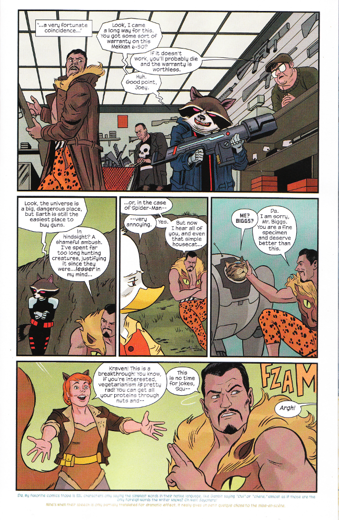
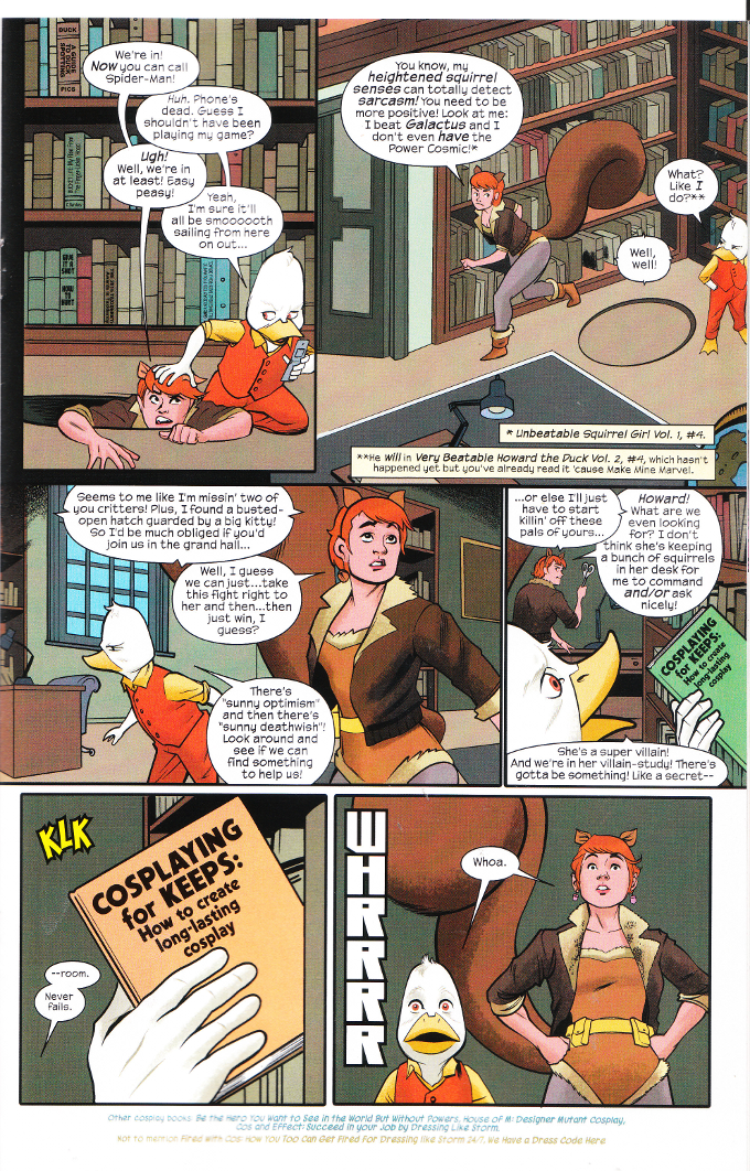
Mere words cannot do justice to the sheer enjoyable lunacy of this series. Ryan North and Chip Zdarsky are to be commended (or is that condemned?) for having raised the bar so high for future comic-writing smart-asses. Trying to detail all of the wonderful witty things in this comic would require me to write an encyclopedia, so I shall instead include a scan of my favorite sight-gag - Punisher with a cart-full of random guns at the same dealership Kraven The Hunter and Rocket Raccoon frequent.


All of this is ably illustrated by a top-notch art-team. That being said, you'd never know that there was a team working on this book because everything fits together so seamlessly. That's surprisingly uncommon on a book with three inkers and two colorists and well-worth praising!


If you haven't been reading Howard The Duck or The Unbeatable Squirrel Girl, this Animal House crossover is just the thing to make you realize just what you've been missing. And what have you been missing? Two of the funniest comics in existence, ya goober!

Monday, November 10, 2014

Earth 2 #28 - A Review

Titled Origins, Earth 2 #28 gives us the origin stories of four characters we have seen in the Earth 2: World's End weekly book.  Well, technically we've only seen the effects caused by a few of them but this is no time to argue semantics.  This book is all about the secret origins of the Four Furies of Apokolips - women chosen to exemplify the forces of War, Famine, Pestilence and Death.


Marguerite Bennett brings her usual sense of heart to these stories.  All but one of them have tragic backgrounds and the one lone hold out - the glutinous Fury of Famine - would be hard to sympathize with even if we did know how she came to be who she was.  It's an interesting point that Apokolips now seems to recruit talent from off-world, as the Furies include a Green Martian (Death), a Czarnian (Pestilence) and a Tamaranian (War).


Each story is illustrated by a different art team.  This gives each story its own individual appearance and each creative team seems well matched to the story of their respective Furty stylistically.  The whole book looks wonderful.

Monday, October 21, 2013

Justice League of America #8 - A Review

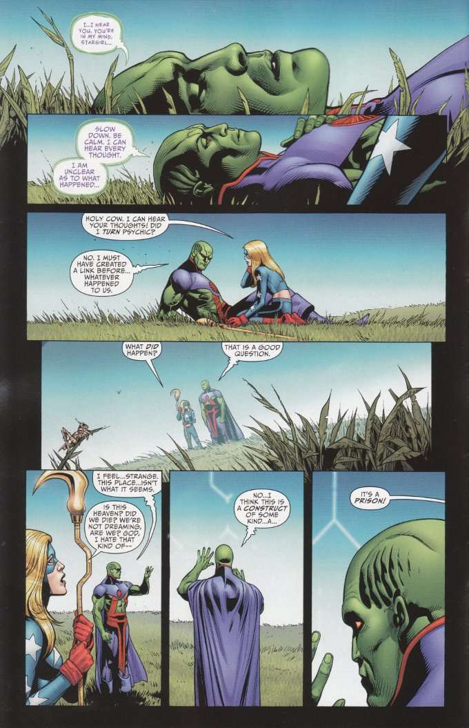
Justice League of America #8 starts promisingly enough, with Martian Manhunter and Stargirl awakening in a field and quickly becoming aware that they are trapped in some kind of prison.  This apparently is the fate of all the world's greatest superheroes in the wake of Trinity War. Placing these two heroes together is a brilliant conceit and one that plays wells to Kindt's experience writing Martian Manhunter.

The main problem is the story fails to build past this concept.  Most of the issue depicts Martian Manhunter as he explores the prison and discovers the ingenious ways that most of the other heroes are being held captive.  There's very little plot or action here, though the ways in which the various heroes are trapped are interesting academically for those fans who like to discuss these sorts of things.


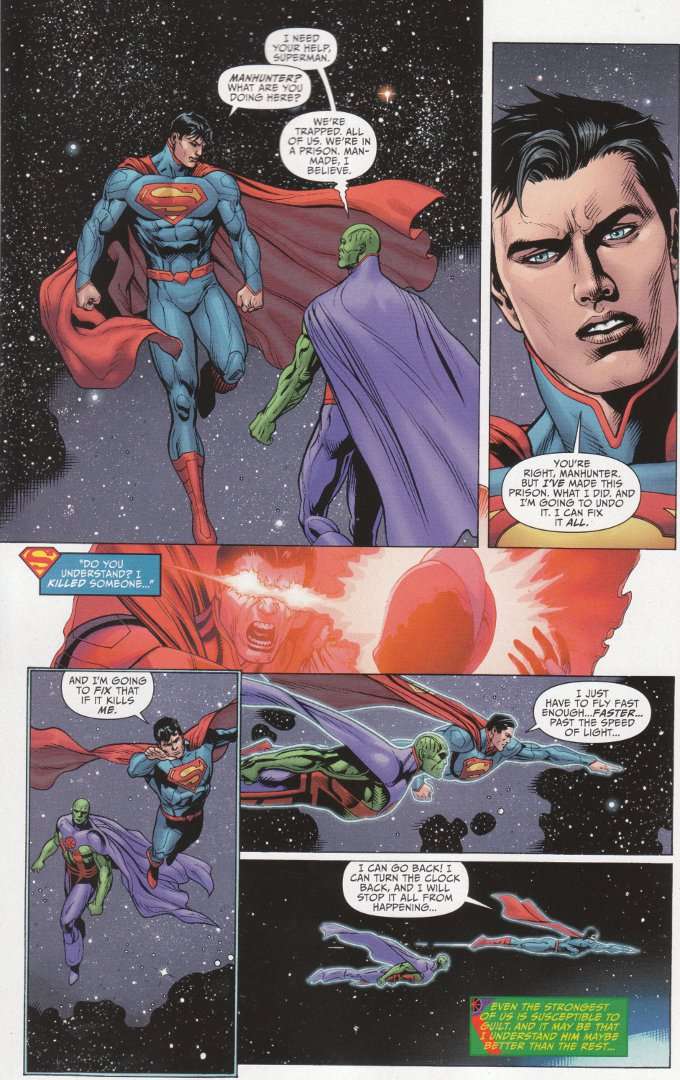
Indeed, Kindt may well be offering some of the best metaphysical examination these characters have received in years.  Superman, for instance is bound both by his belief that he cannot take a life and his desire to make things right.  This has him trapped in a never-ending orbit around the Earth, desperately trying to fly fast enough to go back in time and prevent the mistakes he believes started his current problems.  Why?  Because he's Superman and he has to be perfect.  In just one page, Kindt has exposed the folly of the classicist Superman fans who would have Superman literally running around in circles to remain perfectly pure. 

Wonder Woman is in a similar bind, trapped fighting two armies - Amazons and the US Army - to save her two appointed love interests - Superman and Steve Trevor.  Diana decries how the whole situation has left her paralyzed by her feelings, "simpering (and) weak".  These are the last things Wonder Woman should ever be and the idea of her fighting her own people to save a love interest - much less two of them - is similarly anathema though similarly rooted in the classic stories of the Silver Age.  Thus we have the problem of the modern Diana, who is also forced into contrived and unnatural situations based on what people think her character should be.      


As before, the artwork is largely excellent.  Doug Mahnke continues to show the same skill and quality that he did during his time on Green Lantern.  The only problem is that the general look of his work throughout the book is inconsistent due to four different inkers being employed to handle the shading and detail work.  None of this looks bad as such but it does make the whole affair seem erratic. 

Sunday, August 18, 2013

Justice League of Ameica #7 - A Review

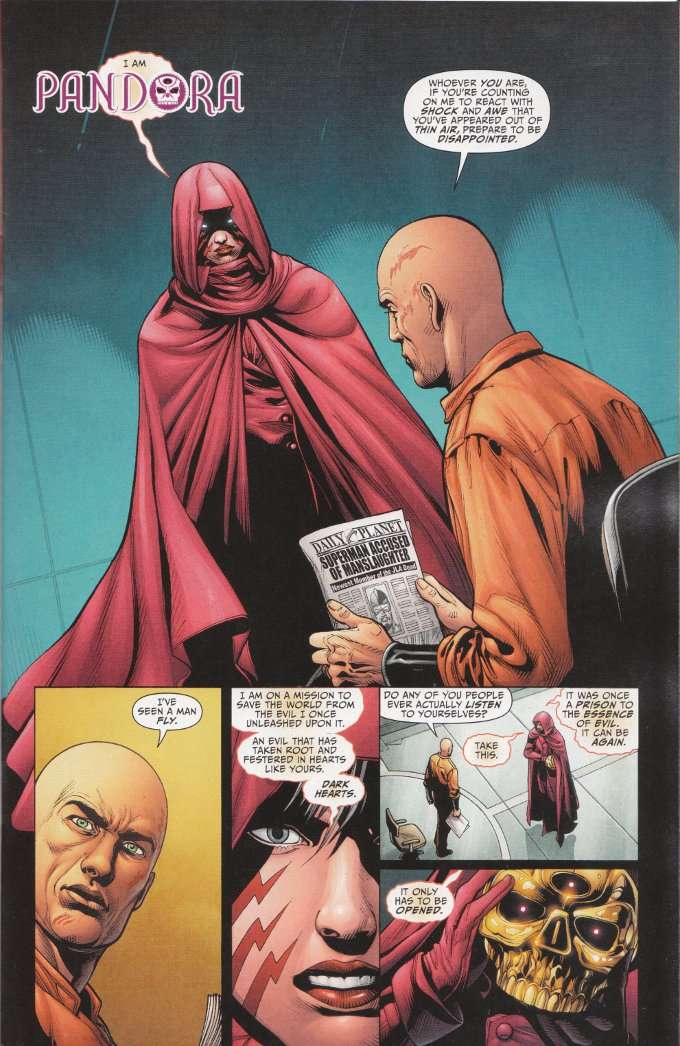
As with the previous chapters of The Trinity War, the best moments of Justice League of America #7 are those brief character moments unconnected to the main plot. Nowhere is this better illustrated than in the opening scene where Pandora confronts an imprisoned Lex Luthor.  Lex is his gloriously snide self and Pandora is... well, a living plot device with no purpose but to push the story forward.


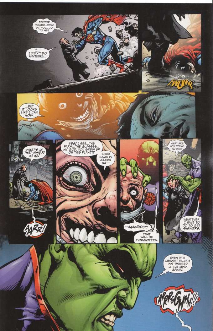
The action of the issue plays out well enough but the moments readers are most likely to find memorable are the quieter scenes where the characters are allowed to talk and play off one another.  Yet Johns and Lemire do find ways to sneak character-development into the action.  Consider the scene where Question's team of League members confronts Dr. Psycho and Martian Manhunter is given a chance to distinguish himself from Superman in terms outside of his super powers.  


The artwork of Doug Mahnke continues to amaze.  His pencils are clear enough and offer a goodly portion of detail without becoming cluttered in the smaller panels.  The book's inking continues to be it's biggest flaw, with a team of five inkers with differing styles rendering the final look of the book inconsistent despite there only being one penciler.

Wednesday, April 10, 2013

Batgirl #19 - A Review

For once, I am at a loss for words.

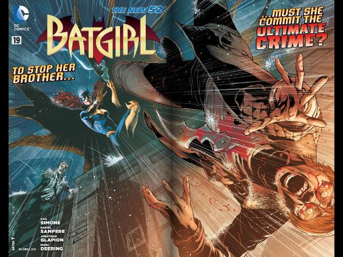
I'm uncertain just how much of Batgirl #19 I should discuss in this review.  To say that this issue is shocking is such an understatement as to require an entirely different word meaning "a particularly huge understatement".  I can say this much.  Gail Simone has come back with a vengeance and even those familiar with her work on Secret Six will be surprised by the darkness of this issue.  


I suppose I can mention that there is another moment in this comic that has little bearing upon the overall plot but which I am sure certain elements shall seize upon as being far more shocking than the action and violence as Barbara confronts her killer brother.  This moment involves Barbara's roommate, to whom Barbara reveals much of her history only to learn a secret in return.  This is familiar territory for Simone, who did not shy away from this sort of thing during her Secret Six run and those familiar with Simone's work are unlikely to be surprised or offended by the revelation offered here.


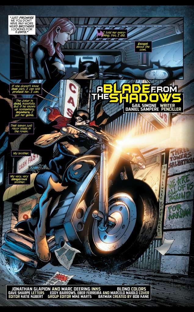
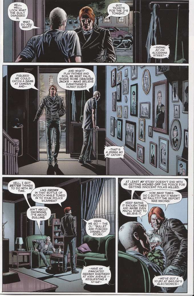
One thing I can say without hesitation is that the artwork by Daniel Sampere, inked by both Jonathan Glapion and Marc Deering, continues to be of the highest quality.  The art team perfectly captures the mood of Simone's script, be it during the moments of high action or the more subdued, conversational scenes.  Truly they are one of the most underrated teams at DC Comics today.  

There's one more thing I can say.  Welcome back, Gail!  We missed you!

Thursday, March 7, 2013

Doctor Who #6 (IDW Vol. 3) - A Review

Reviewing Doctor Who can be a challenge at times.  I frequently find myself feeling like a broken record, when my complaints and complements about one issue mirror my comments about the previous issue.  Such is the case with Doctor Who #6, which continues the trends set by Issue #5 for good and for ill.

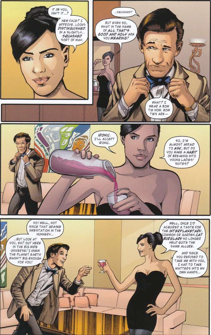
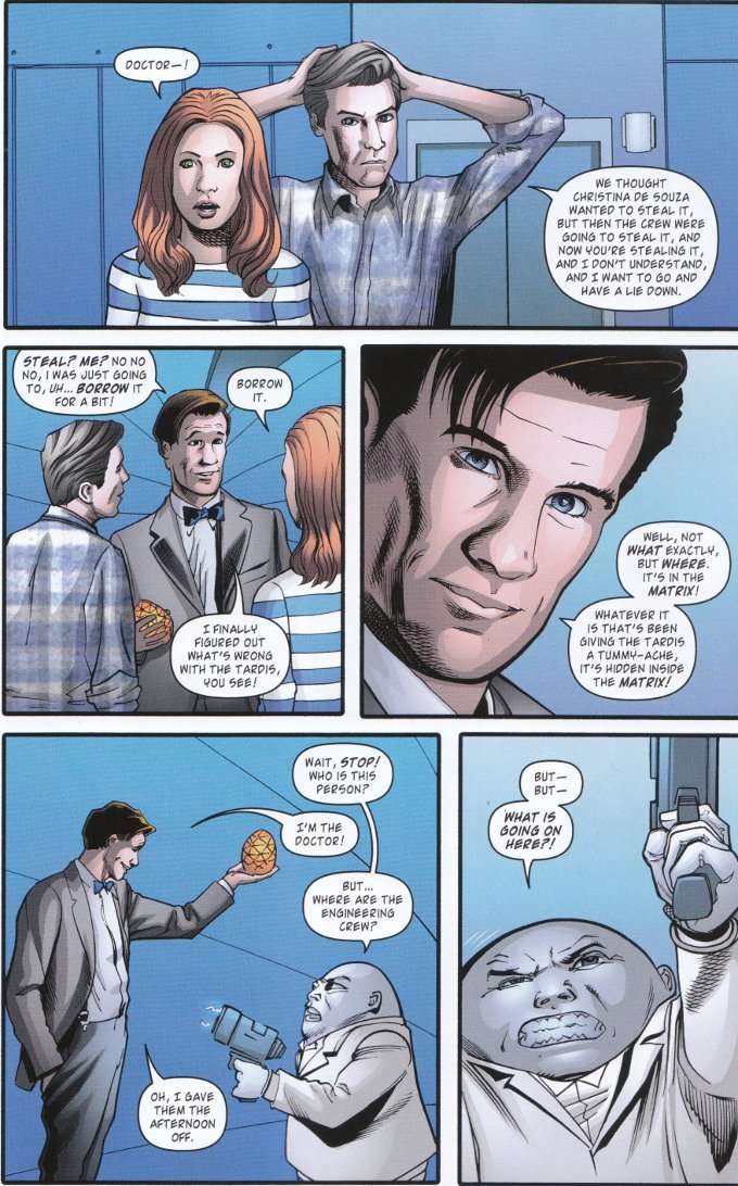
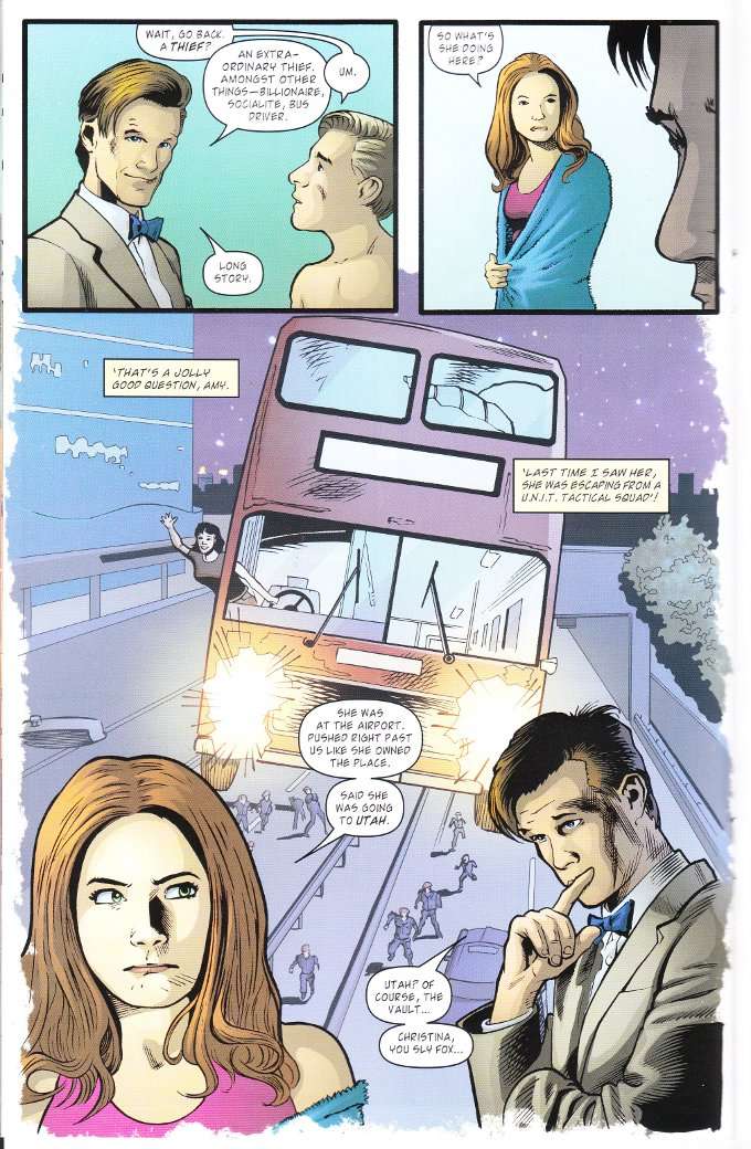
The script by Andy Diggle blends various elements from stories involving the Ninth, Tenth and Eleventh Doctors as The Doctor takes the Ponds on a cruise in space.  It turns out that one of the other guests is Lady Christina De Souza - a cat burglar who crossed paths with The Doctor once in his Tenth incarnation and has somehow gained the ability to travel between planets.  What she's up to winds up tying into a most unusual heist where multiple thieves pursue differing ends and even The Doctor is not entirely what he claims to be.


As one might expect with Andy Diggle writing, this is all a rollicking good read.  Diggle explains everything taken from the show for those few who might be reading this comic without having seen all of the stories he refers to.  There's some honestly shocking twists and those who worry about the morality of The Doctor allying himself with an unrepentant thief who steals for the heck of it will find themselves pleasantly surprised.


The artwork continues to be this book's weak point.  Josh Adams' artwork isn't all bad but his character designs are still inconsistent from panel to panel, managing to make even the alien creatures that are meant to look distorted seem off-model.  The colorist chose a poor palette which leaves Amy Pond looking like Daphne Blake from Scooby Doo and Rory Williams grey before his time.

If you're a Doctor Who fan who enjoys a good story no matter what the medium, you should give this issue and the one from last month a chance.  It should be a must read for any Doctor Who fan.  Avoid this only if you are one of those rare few who absolutely cannot ignore some shady artwork for the sake of a crackerjack tale. 

Tuesday, February 12, 2013

Doctor Who #5 (IDW Vol. 3) - A Review

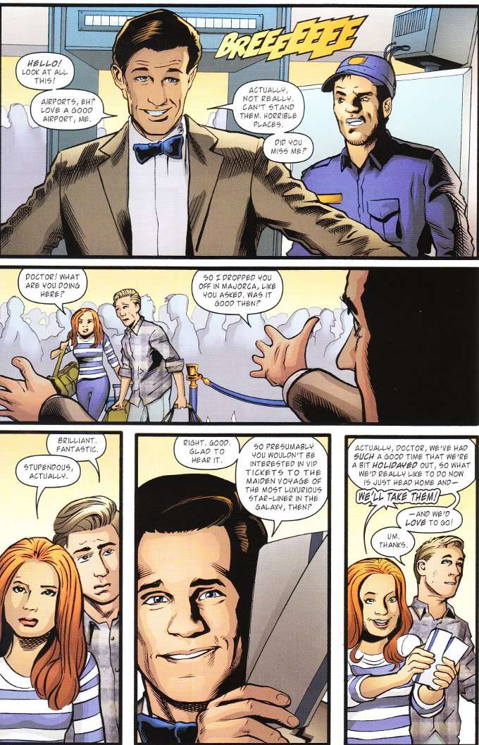
Looking back, the biggest problems I've had with with most Doctor Who comic book adaptations have always lain with the artists.  Talking with my fellow Wholigans, I find they're of a similar mind.  I don't know if it's because the characters' appearances are so ingrained in our minds because of the TV show that we judge any "off-model" artwork as utterly irredeemable.  What I do know is that Josh Adams' character designs are half-successful, at best, in capturing the essence of our heroes. 

There are some moments where Matt Smith's Doctor does indeed look like Matt Smith and other moments where he resembles Dick Van Dyke.  Rory Williams suddenly ages 20 years between panels, as his hairline recedes halfway up his scalp.  Colorist Charlie Kirchoff doesn't help matters, occasionally coloring Amy Pond's hair with the fiery red shade of Karen Gillan's locks and other times painting her as orange as Daphne from Scooby Doo!


Thankfully, while art issues are commonplace on Doctor Who, so are excellent scripts.  This issue proves no exception, as author Andy Diggle spins a tale that draws off elements of the Ninth, Tenth and Eleventh Doctor's tenures.  Having rescued The Ponds from a disastrous holiday that's left them stranded in a Spanish airport, The Doctor spirits them away on the maiden voyage of a cruise starship.  Surprisingly, The Ponds discover that the annoying rich woman bound for Utah who delayed their flight on Earth is somehow on the starship.  Even more astonishingly, The Doctor recognizes her as Lady Christina De Souza - the infamous cat-burglar who helped him save a bus full of people from The Planet of the Dead.  How did she wind up in deep space in the future?  The answers may lay in a mysterious vault in Utah, which The Doctor visited once before...


Diggle's story throws us several mysteries and long-time Doctor Who fans will appreciate the craft involved in mixing these previously uninvolved elements into a new story.  The issue also closes on a wicked cliffhanger that will leave you desperate for the next issue.  If you haven't given Doctor Who a chance in comic form and can deal with some jammy artwork, this would be a good book to cut your teeth on.

Wednesday, September 19, 2012

Green Lantern Corps #0 - A Review

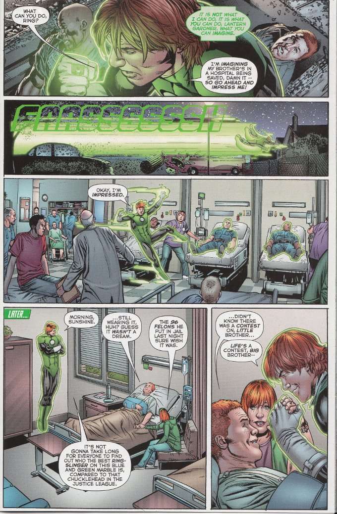
Green Lantern Corps #0 surprised me. Most of the revamped origins we've seen so far during Zero Month have been darker than the old-universe - Superman lacks the support of the Kent family, Oliver Queen was responsible for people getting killed through his negligence and Mitch Shelley is the good clone of an evil man. So how is it that a character who is synonymous with the 80s Anti-Hero has somehow gotten a less-depressing origin story?


The origin of Guy Gardner we see here preserves most of the elements of the original. Guy still plays Esau to his older brother's Jacob. His drunken father continues to favor his eldest son over the younger Guy. And Guy still idolizes his older brother and is desperate to win the approval of his family.

And this is a lighter origin?

Shockingly, yes. Peter Tomasi eliminated the child-abuse from Guy's background. More, he gives Papa Gardner a motivation for treating Guy like slime and pushes Guy's "punk" days forward a little, transforming Guy into a street thug rather than a juvenile delinquent. There are other subtler changes, such as Guy now being a neglected middle child with the addition of a younger sister and Guy's beloved older brother having his name changed from the unlikely Mace to the more alliterative Gerard.

This is all fascinating from the view of a Green Lantern scholar such as myself. But in discussing all this I've missed that all important question - is this a good read? The answer is a hearty yes. Tomasi's script is a great one and he really brings the characters to life. Guy is an immediately sympathetic figure who the reader wants to see succeed - brave, noble and resourceful in spite of his emotional hang-ups.


Green Lantern Corps is blessed with one of the greatest and most underrated art teams in comics. Penciller Fernando Pasarin is a master at getting the maximum amount of detail into the greatest number of panels. The inkers know when to tread lightly and when to emphasize the shadows in a scene. And colorist Gabe Eltaeb always seems to know just the right shades and highlights to use.

If, for whatever reason, you can only read one Green Lantern comic each month, make it this one. Between Peter Tomasi's scripts and the amazing art team, it has yet to disappoint me. I think you'll all enjoy it too.